Home decor trends and home decor trends go…
We can all remember a time when shag carpeting or avocado appliances were the height of sophistication. It can be tricky to separate the classic from the trendy when embarking on a home renovation. The last thing any of us want to do is invest in expensive and permanent changes to our home, only to find they’re as passé as popcorn ceilings in a few years time. That is why it’s nice to have experts at the ready who can help guide us to choices that we will want to live with for decades.
Color and pattern are having a real moment in terms of design trends, and we meet with lots of clients who are interested in adding some visual interest to their homes, but are concerned about what might turn out to be “too much” or “too trendy” as times goes by.
Our award-winning Interior Designer Brooke Weinert and architectural representative Christine Raible of Best Tile were kind enough to sit down with us to talk about ways to incorporate color and pattern into our home decor in thoughtful ways that will stand the test of time.
On Color Choices:
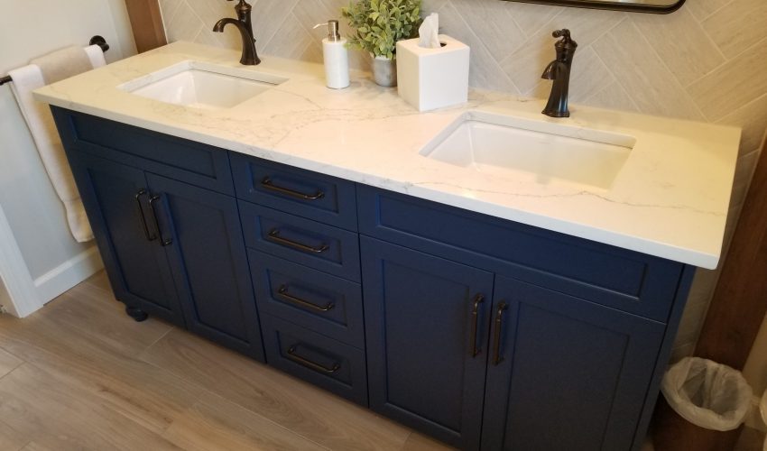
Brooke: I like to incorporate color in permanent fixtures (tile, cabinetry, etc.) using more tonal or muted versions of colors that the clients already have in their home. For example, if the clients like blue and have blue in other parts of their home, I’d recommend a slate blue or navy blue tile or island accent. Both slate and navy are shades of blue that are still regarded as neutral “tones” that read blue and bring out blue in other colors close by.
We are less likely to get sick of neutral colors, because they tend to play well with many different colors. I think the stem of the issue of things being trendy and going out of style are when we choose bright tones that draw our eyes’ attention much more quickly. So when we inevitably want a change, a bright blue island is going to make repainting and redecorating much more difficult, resulting in wanting a total renovation.
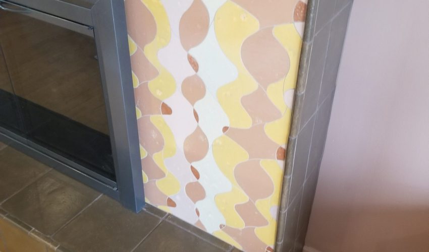
Christine: With tile especially, because it is so permanent, I try to recommend one showpiece in the space that has color and pattern, whether that be the countertop, the floor tile, or an accent mosaic. Then all of the other parts of the space become supporting roles to that feature. There can be other colors and patterns in the space, but having that one feature helps it to not become overwhelming and too trendy.
On Picking Patterns:
Brooke: I love pattern and texture, and these two often work hand in hand. I think these add a very important depth to a design that can sometimes be overlooked. However, you have to be careful when choosing something with a pattern or texture, to avoid making your space look too busy, and therefore, seem smaller.
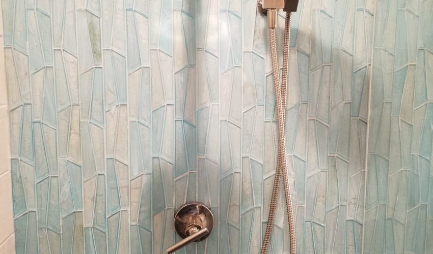
If you’re hoping to do an accent tile to incorporate a pattern in your shower, for instance, you want the patterned portion to distinctly stand out from the rest of the wall tile. So you don’t want to choose a wall tile that has a lot of movement and variety, because it will compete with the patterned tile and become difficult for our eyes to process.
One thing that I think is often forgotten when choosing a patterned tile is ensuring that the pattern works well with the style of the home and stays in tune with the design style. I’ve seen so many Houzz images where there’s a gorgeous traditional white kitchen with a bar area that has an accent patterned backsplash that looks like it belongs to another house. We don’t want that!
Another way I like to incorporate pattern/texture is switching the installation format of the tile. This is a fun way to play with a “classic” tile and make it a bit more fun. I love when we have clients who come in saying they “hate subway tile”, and then we show them the many ways that it can be installed and they look at it in a whole new light.
Trends that Aren’t Too Trendy:
Brooke: Trends I’m seeing include the incorporation of a color, either in the backsplash or island. I’ve also been seeing a lot of accent backsplash behind the ranges again, mainly carrying the countertop up as the backsplash behind the range only. I’m not sure if it’s because people have been stuck at home for so long and want a change, but it seems like a lot of clients are wanting to express themselves with brighter tones and bolder patterns in their homes than they had pre-Covid lockdown.
Christine: Glazed ceramic wall tiles are very popular and I feel they are also very classic and timeless. There are so many options and you aren’t stuck to just the traditional white subway tile. These tiles come in a range of sizes from 2×8 to 4×16 and many other sizes in between. They also have a range of colors, patterns, and glazing. Adding a glazed ceramic tile with variation in the glaze is a nice way to add a little pattern and interest without making the space too busy.
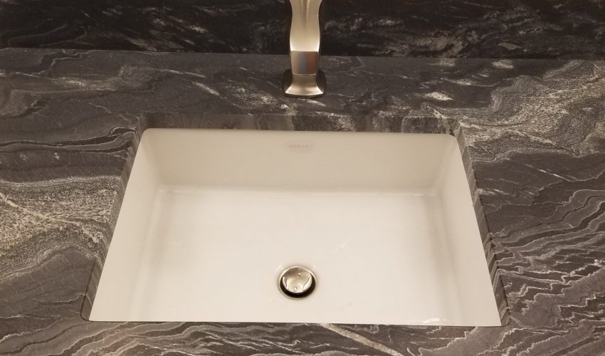
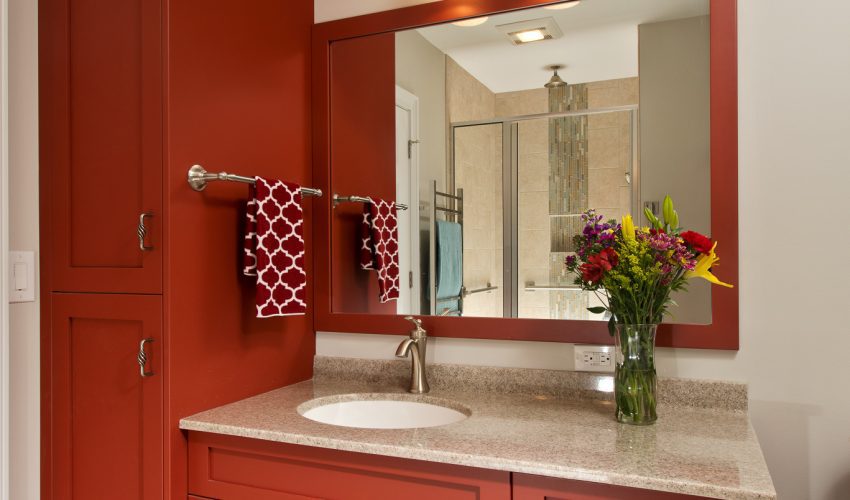
Adding a mosaic as a vanity backsplash in lieu of a traditional 4″ quartz or granite backsplash is a fun way to add a pop of color and pattern behind your sinks. Accenting the back of the niche in your shower with an accent tile also adds a subtle pop. Powder rooms are the perfect place to play with color. This is the space that your guests most often use and they are a separate space from other spaces so you can really play with patterns in there. I often used patterned porcelain tiles or stone mosaics with variation in these spaces.
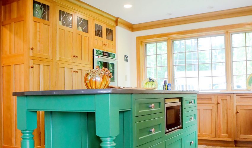
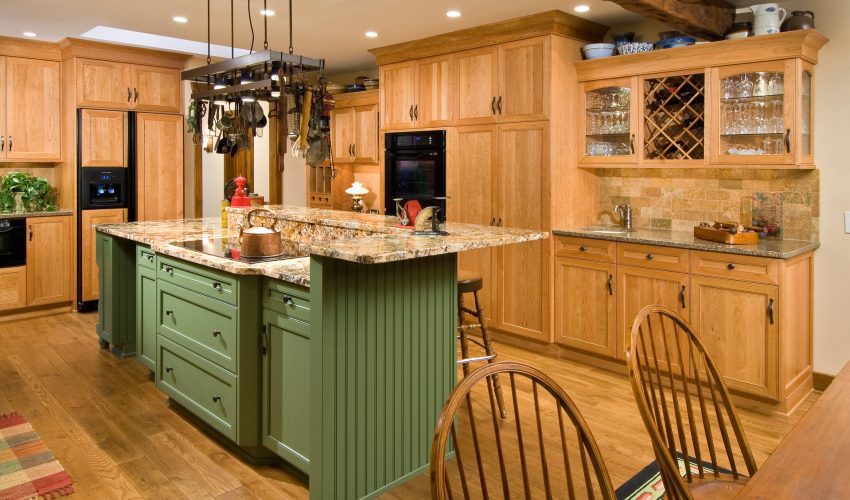
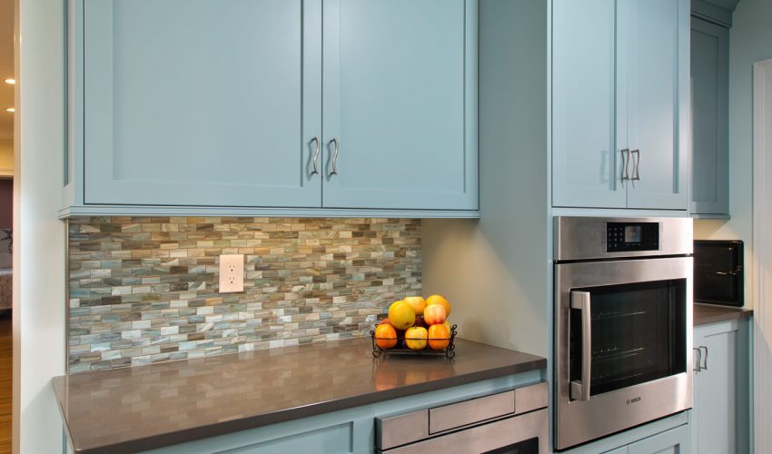
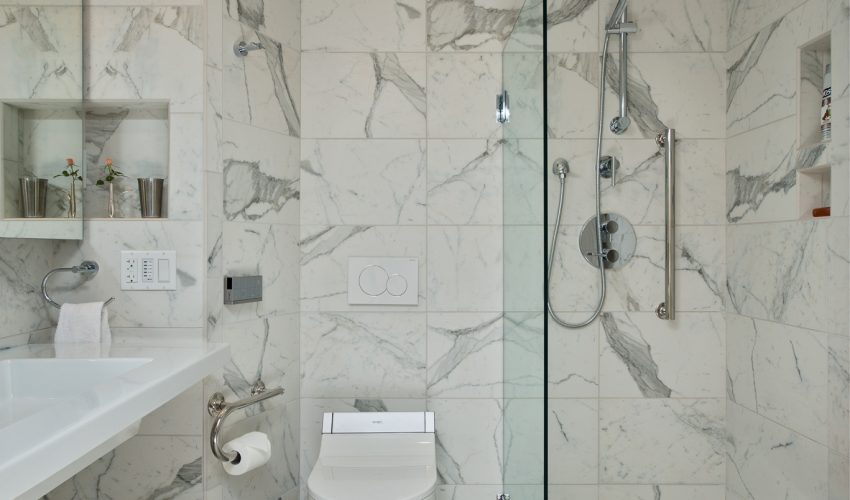
Check out some examples of color and pattern trends in our projects below and consider adding a pop of visual interest to your next project. With Brooke and Christine’s expert guidelines in mind, there are plenty of ways to spice up your space in a timeless and elegant way.