We recently asked our in-house designers Brooke Weinert and Kara Woitkoski to share some of the latest in kitchen design trends. From mixed metals to clever organization systems, read on to learn more details and see photos of how these design elements can be incorporated into your home.
- Use of Walnut Interiors:
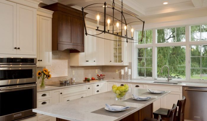
We’re seeing an increase in people wanting more of an accent and contrast at the interior of their cabinetry. While this is a bit more upfront cost, it’s an irreplaceable and gorgeous look and immediately adds visual value to kitchens of all colors and tones.
- Mixed Metals for Cabinetry Hardware (and elsewhere!):
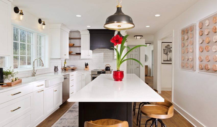
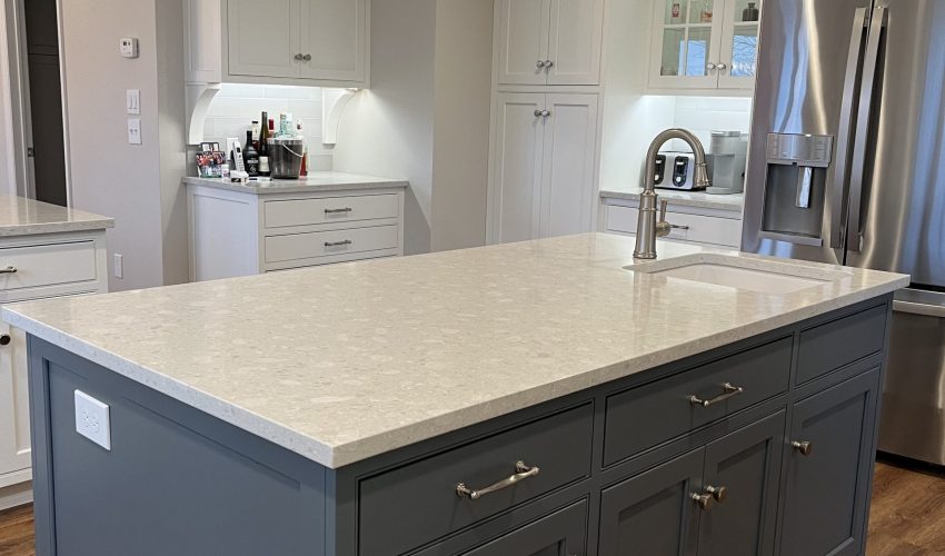
Rather than sticking with one finish, we think there will be an increase in the use of mixed metal tones. The use of a darker backplate with a brass or pewter pull can really make hardware a statement. At the same time, we’re seeing the islands being used as a place for statement hardware. For example: we may use a satin brass knob at the perimeter cabinetry, but select a larger, more decorative cup pull in a more antiquated finish for the island as a feature. This makes the island stand out and feel more like a furniture piece. In addition to the cabinetry hardware, we’re seeing this spread to other areas of the kitchen as well. We’re no longer selecting one finish for the entire kitchen, but truly allowing the hardware, fixtures, and lighting to all complement each other in different tones. This makes a space feel much more unique and thought out, rather than just selecting the same finish for everything.
- Door Details:
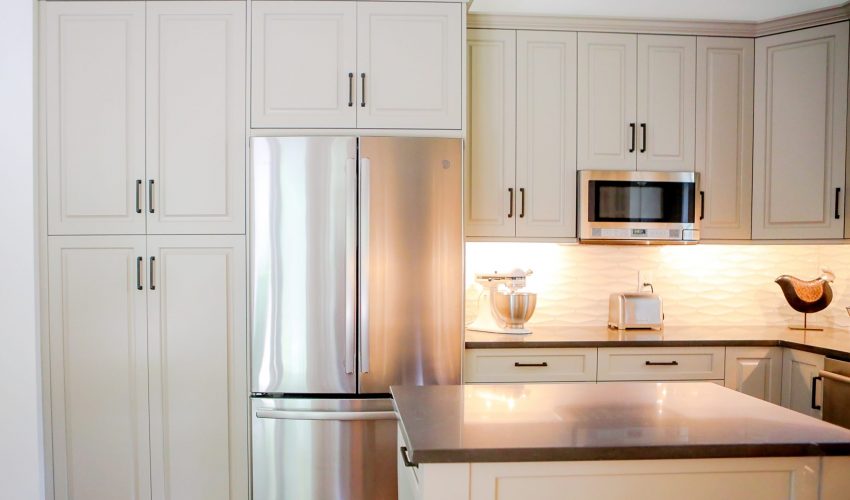
For the past few years, the most popular door styles were all flat panel or “shaker” style. But the tide is shifting! Lately, we’re seeing more interest in decorative door styles being used in a more contemporary way. We’ve been using more raised panel door styles and even some flat panel doors with applied molding. These door styles are gorgeous and create a unique, boutique look.
- Organization & Space Savers:
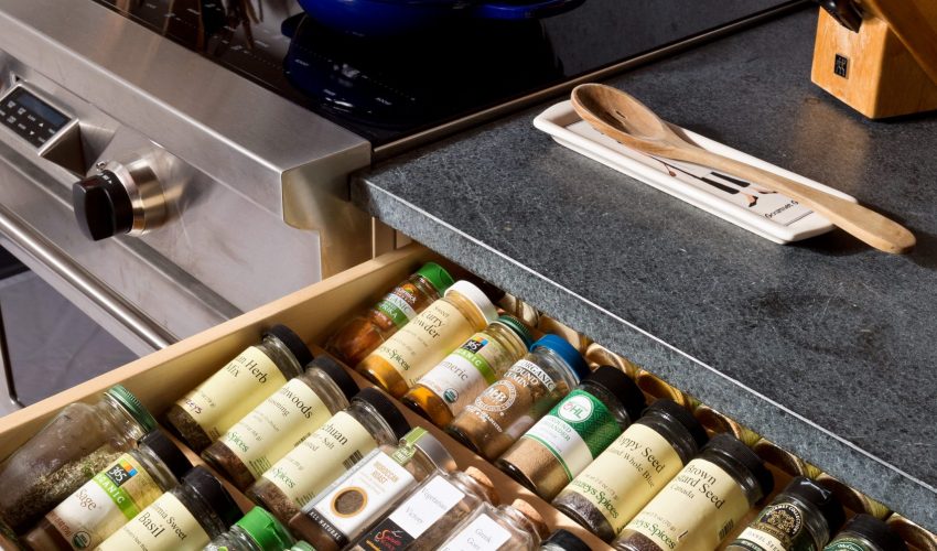
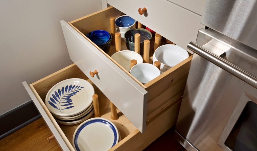
This will never go out of style, but certainly ebbs and flows with all other “trends”. Lately, people are focused on optimizing space and becoming more organized. All of our kitchens are custom designed to be functional and fit our clients’ needs, but sometimes we’re able to take it even further. Using custom drawer dividers, dish storage pegs, spice bleachers, custom filler rollouts, and (for those who hate lazy susans) blind corner optimizers! We’ve been seeing even more interest than we typically do in going the extra distance to ensure every inch of the kitchen is going to be utilized.
- Two Tone (or more!):
Our clients love the opportunity to incorporate more than one cabinet tone (and so do we!). We’re very much used to doing two tone kitchens. But lately, we’ve seen people incorporating three tones in one space. We think that when it is executed well, it’s a gorgeous look. We have a kitchen coming up that is using a beautiful cream tone for the upper cabinets, a truffle brown for the base cabinets, and a walnut island and we cannot wait to see it all come together.
Check out the slideshow for examples of some of these kitchen design elements in our projects!
