Go With the Flow

Sometimes the right renovation project doesn’t aim to vastly alter the size of a space, so much as make better use of it for the homeowners.

This was a key element of the kitchen renovation for these clients, who found that their original cooking space left them continually bumping into one another when trying to prepare a meal.

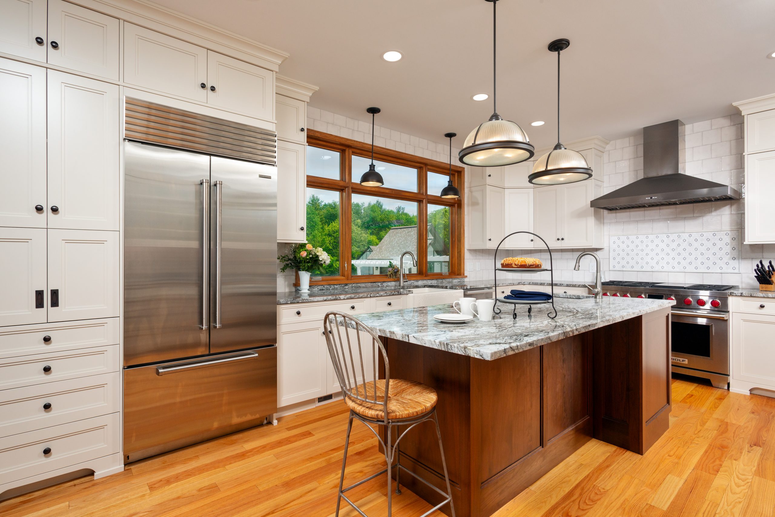
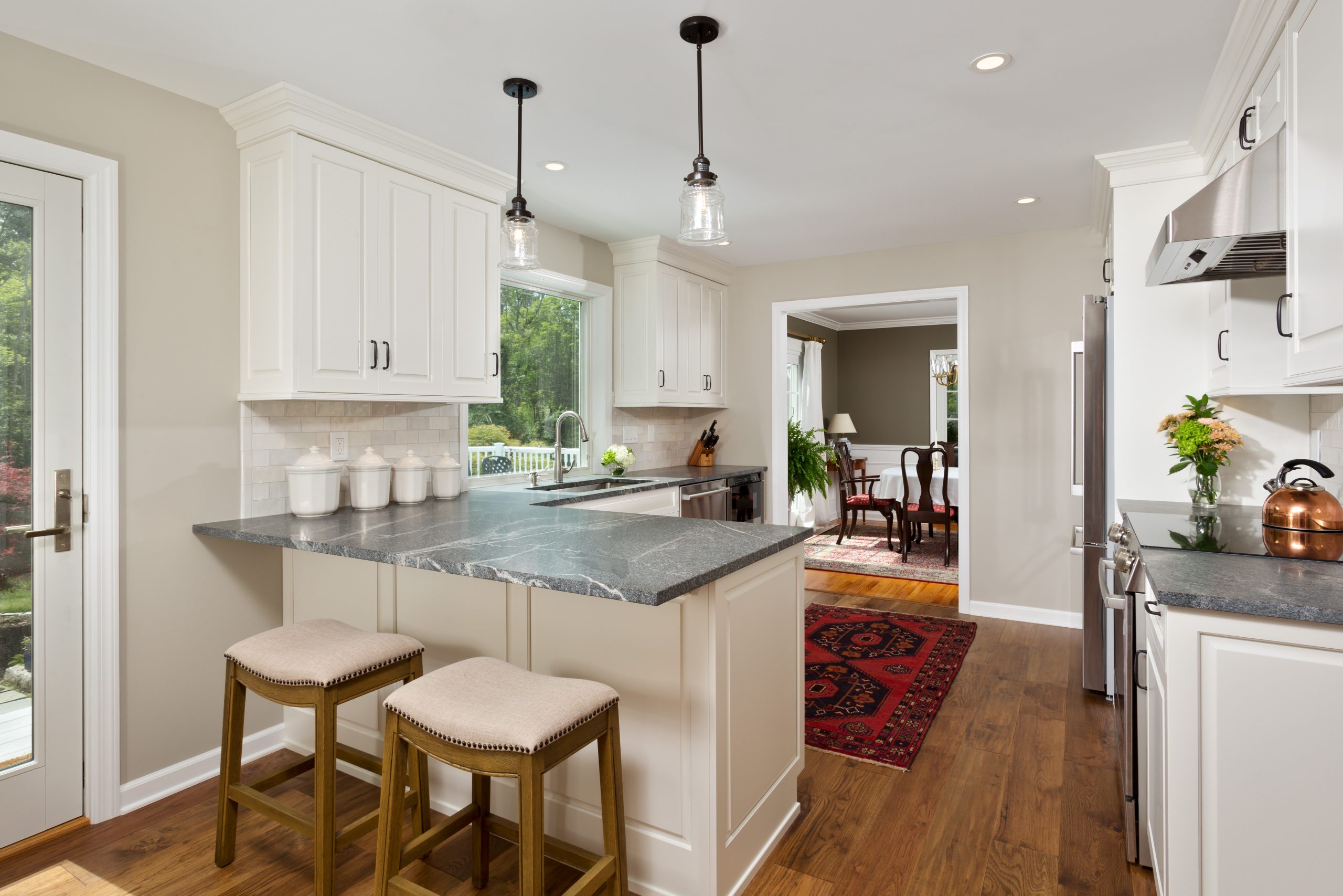
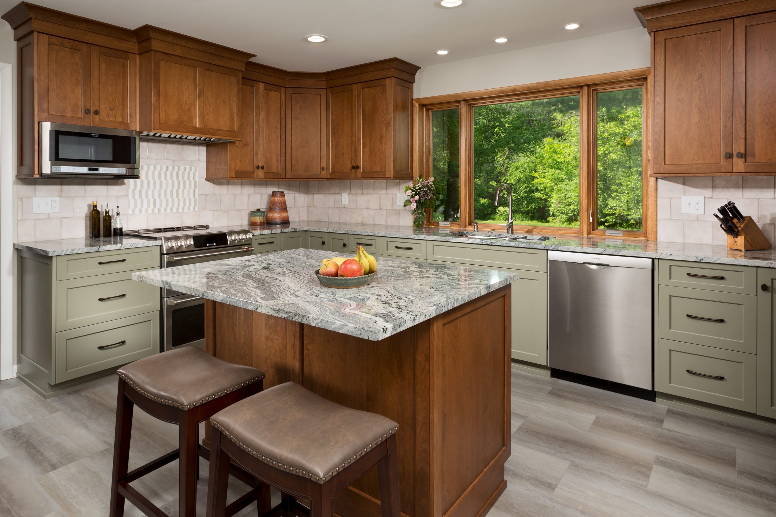
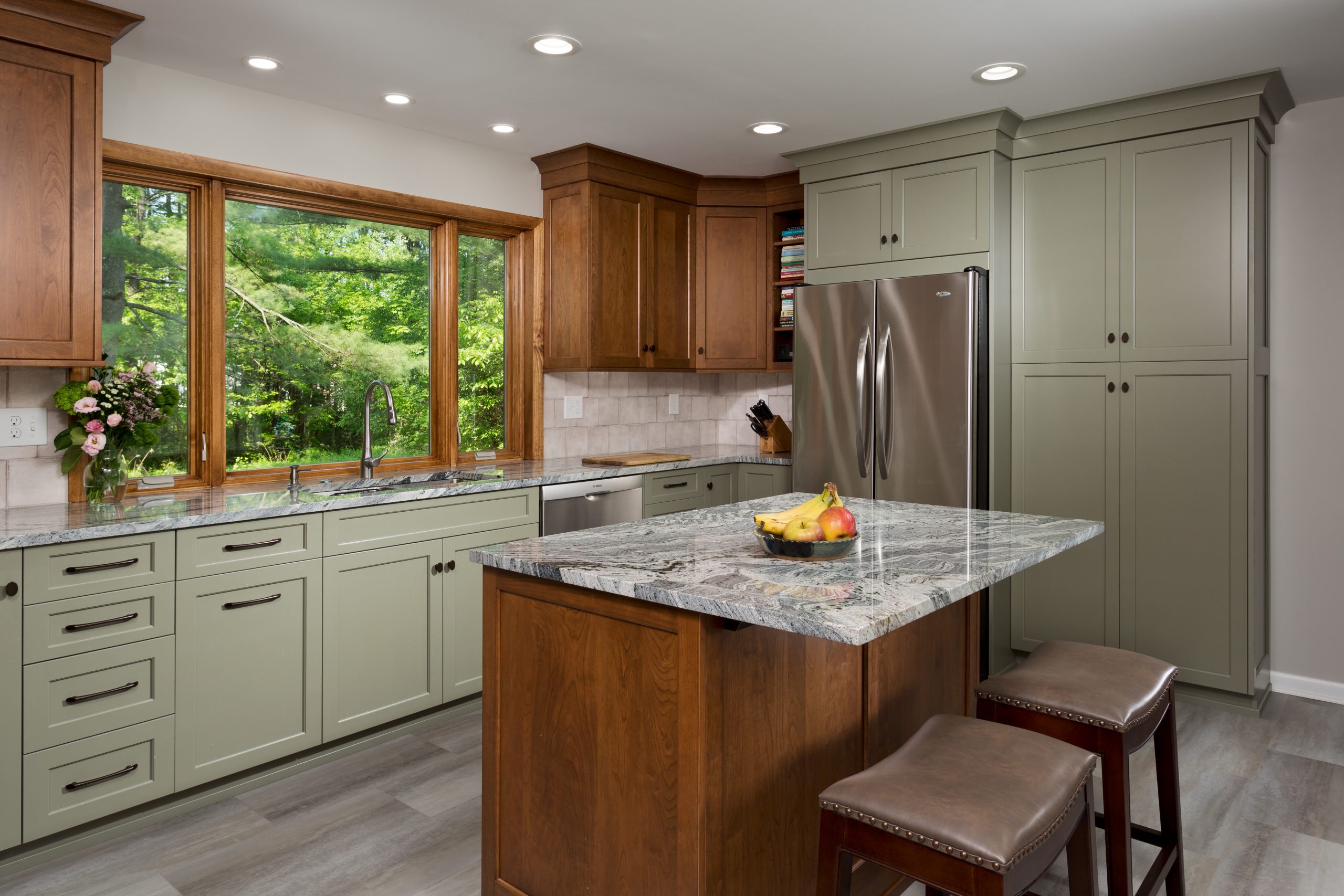
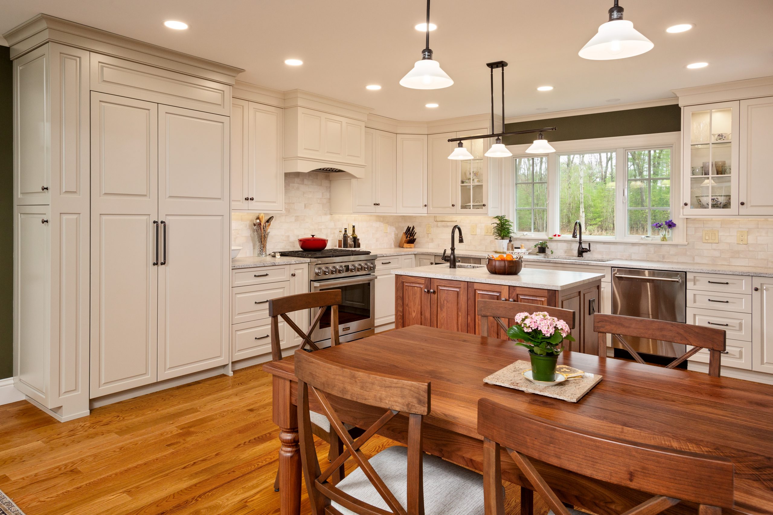
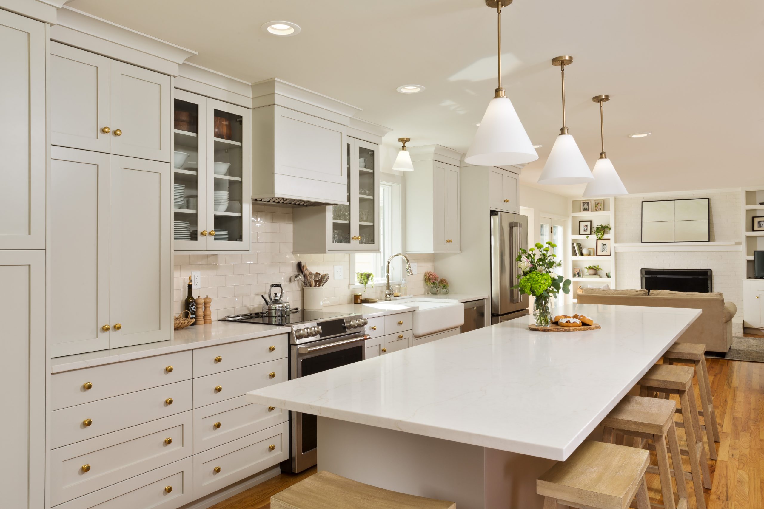
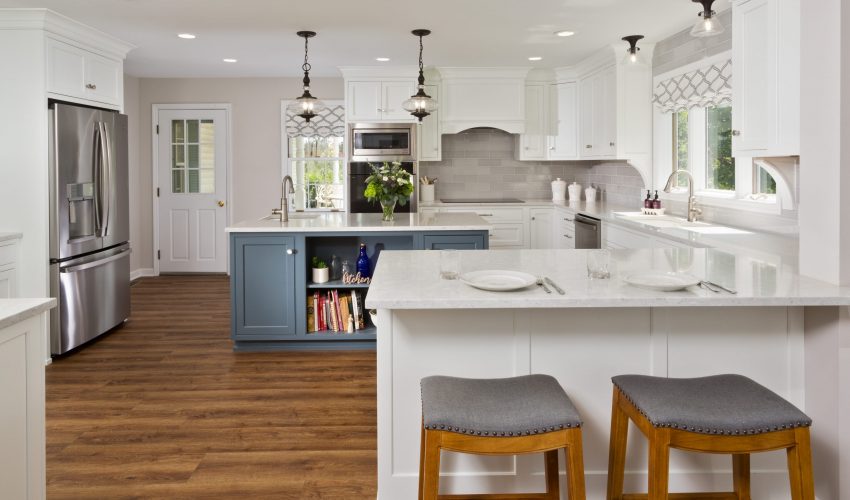
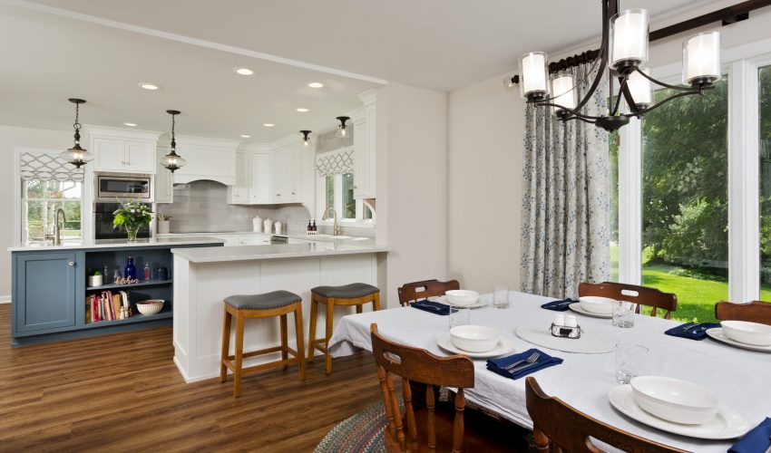
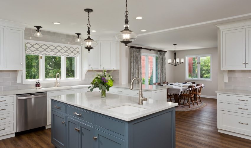
To give the homeowners more room to work and enjoy their kitchen, we changed the orientation and traffic flow of the room. We removed an eat-in table and added a kitchen island, which offers additional counter space and seating. We repurposed a salvaged patio door and moved it into the dining room, which creates a better traffic flow pattern. We also replaced the existing kitchen window with a much bigger window, optimizing the view, and giving a sense of openness and light to the space.

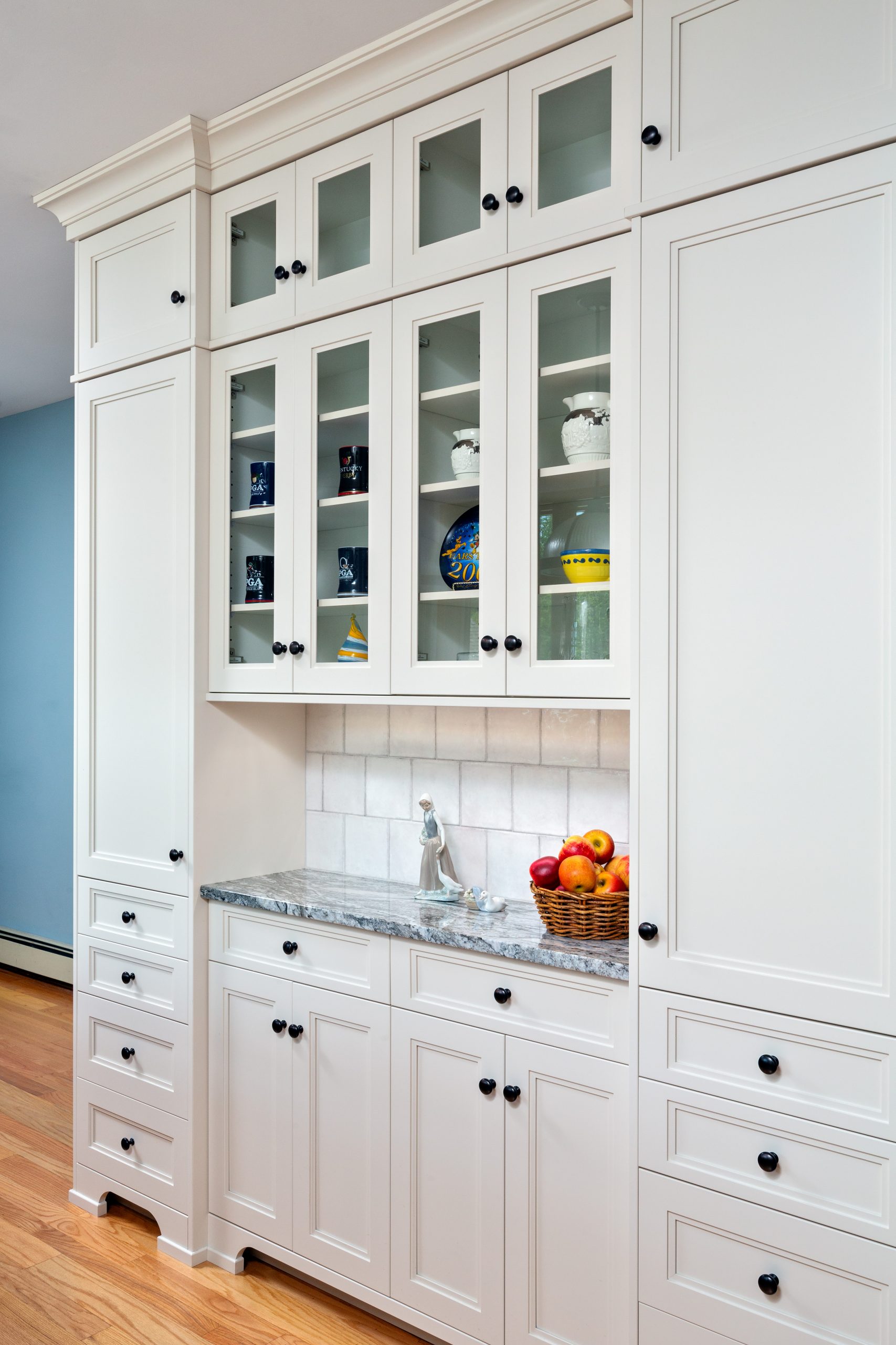
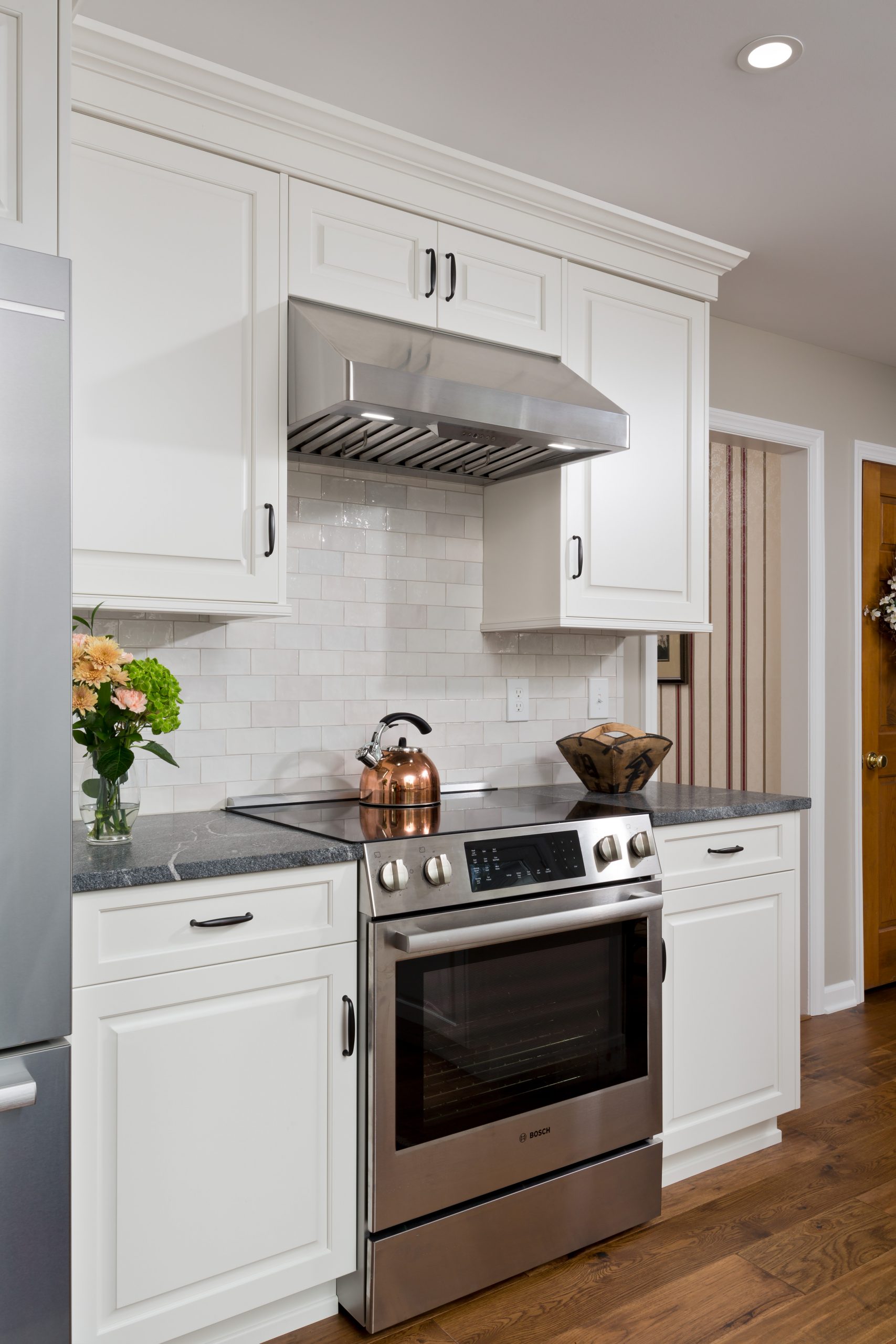
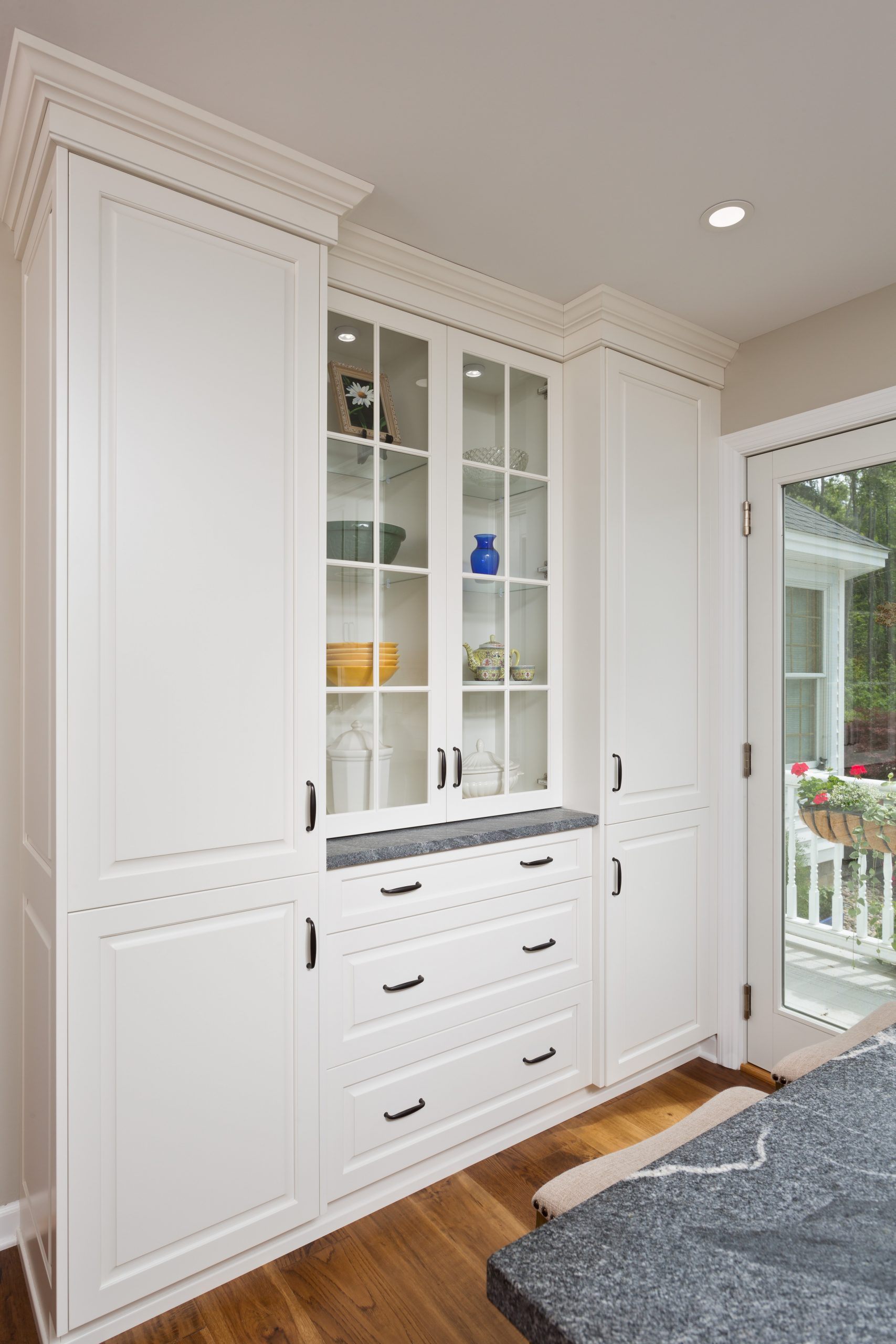
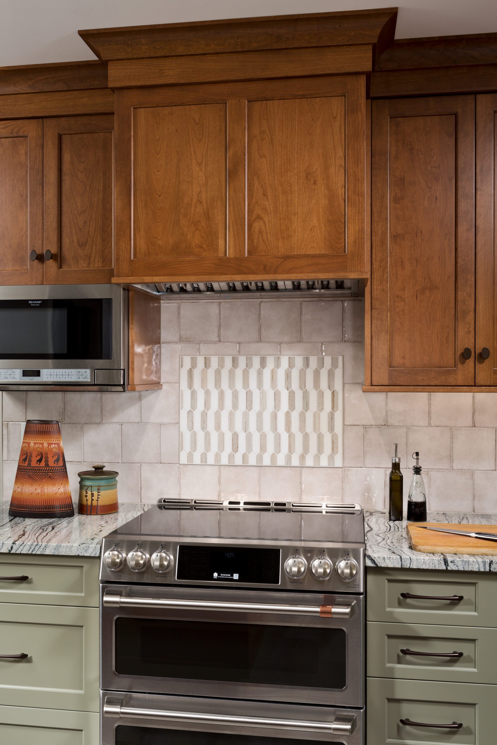
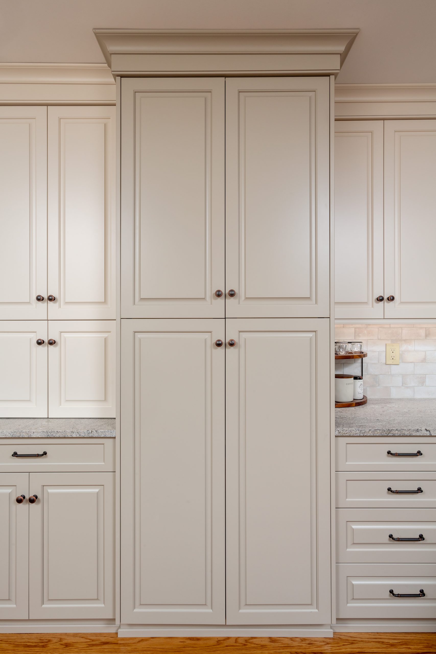
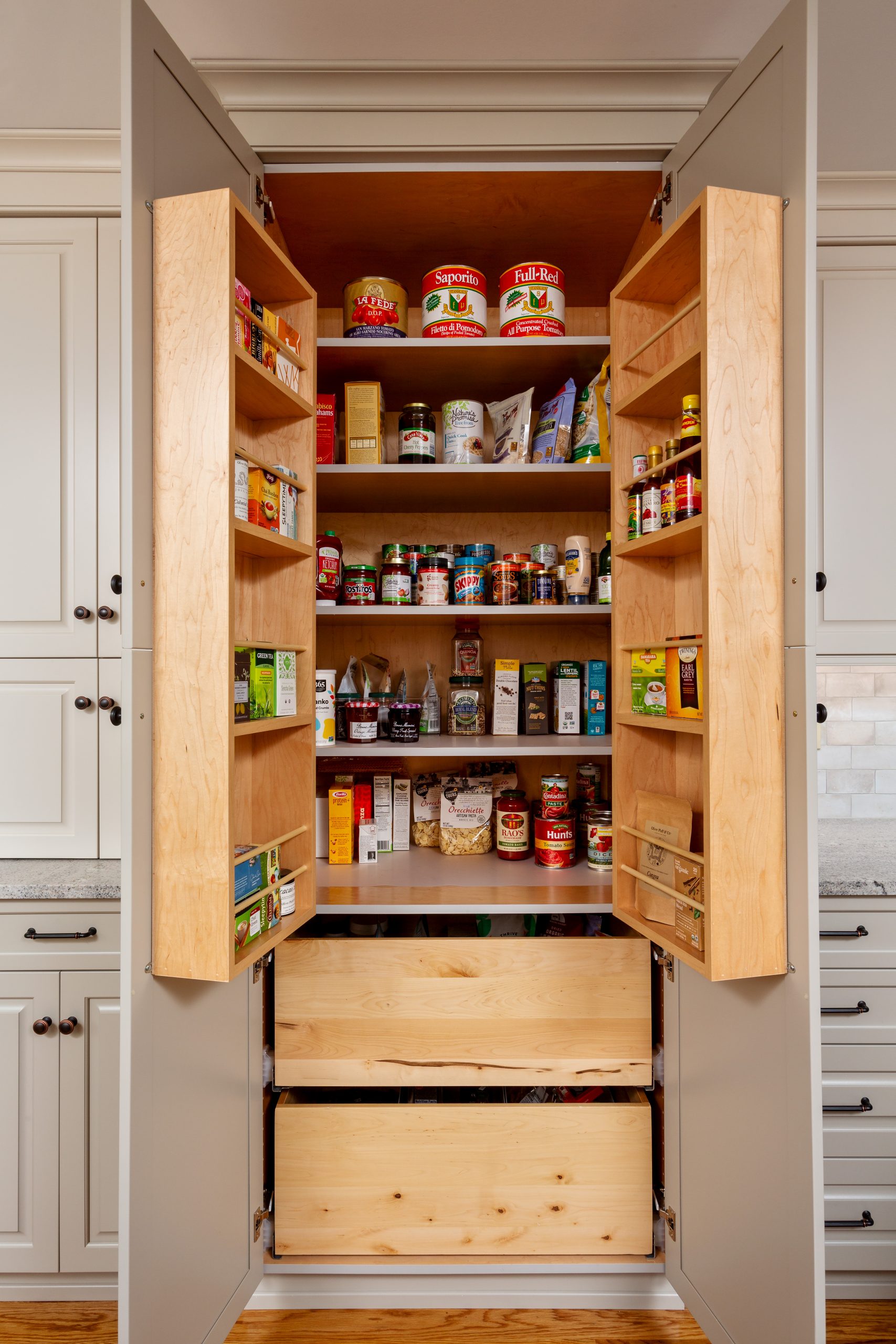
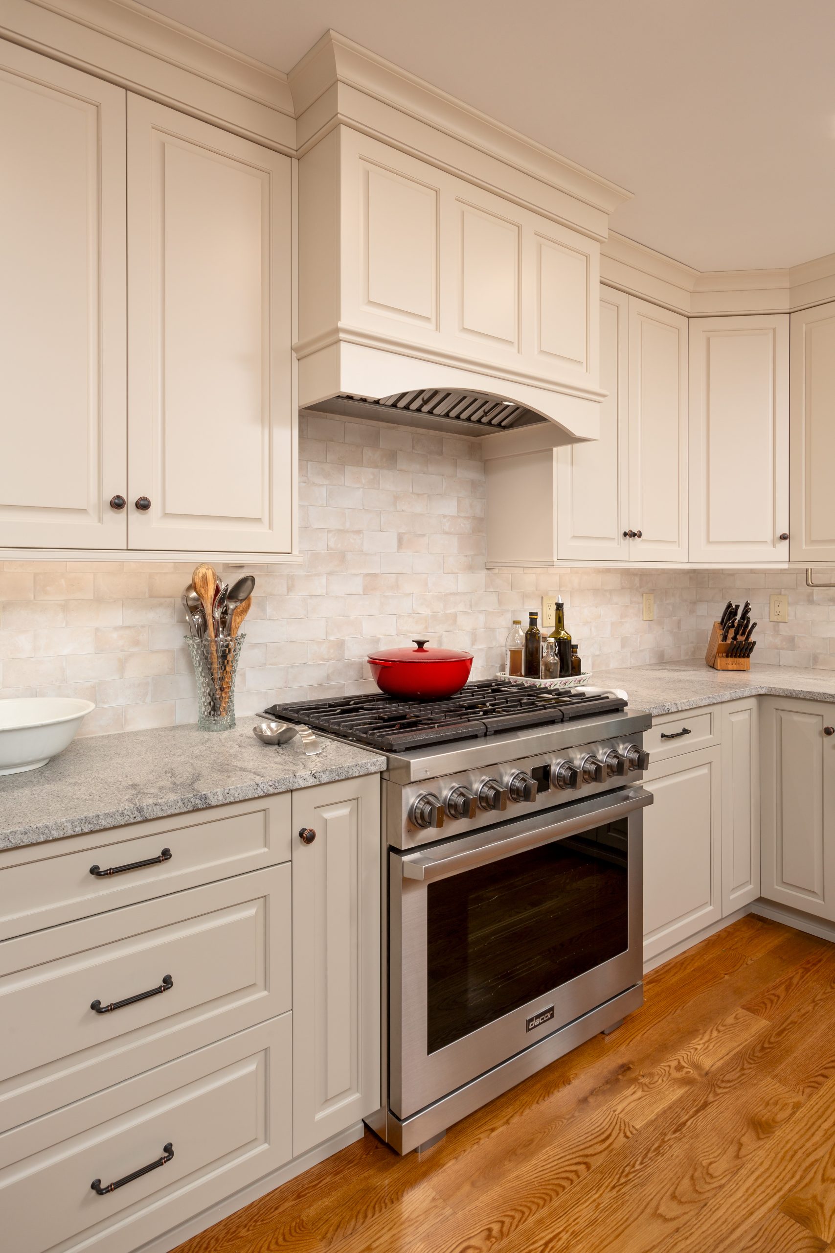
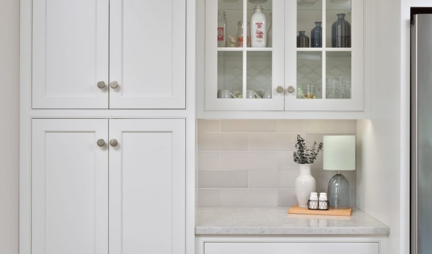
The kitchen also got a beautiful design upgrade, with custom cabinetry in two different, but complementary materials. The new dedicated pantry space, soft close drawers, and luxury vinyl tile flooring all come together to create a modern, sleek, yet warm aesthetic.

Our clients are thrilled with their renovation, and the improved functionality and flow of their kitchen.

Design Details that Delight

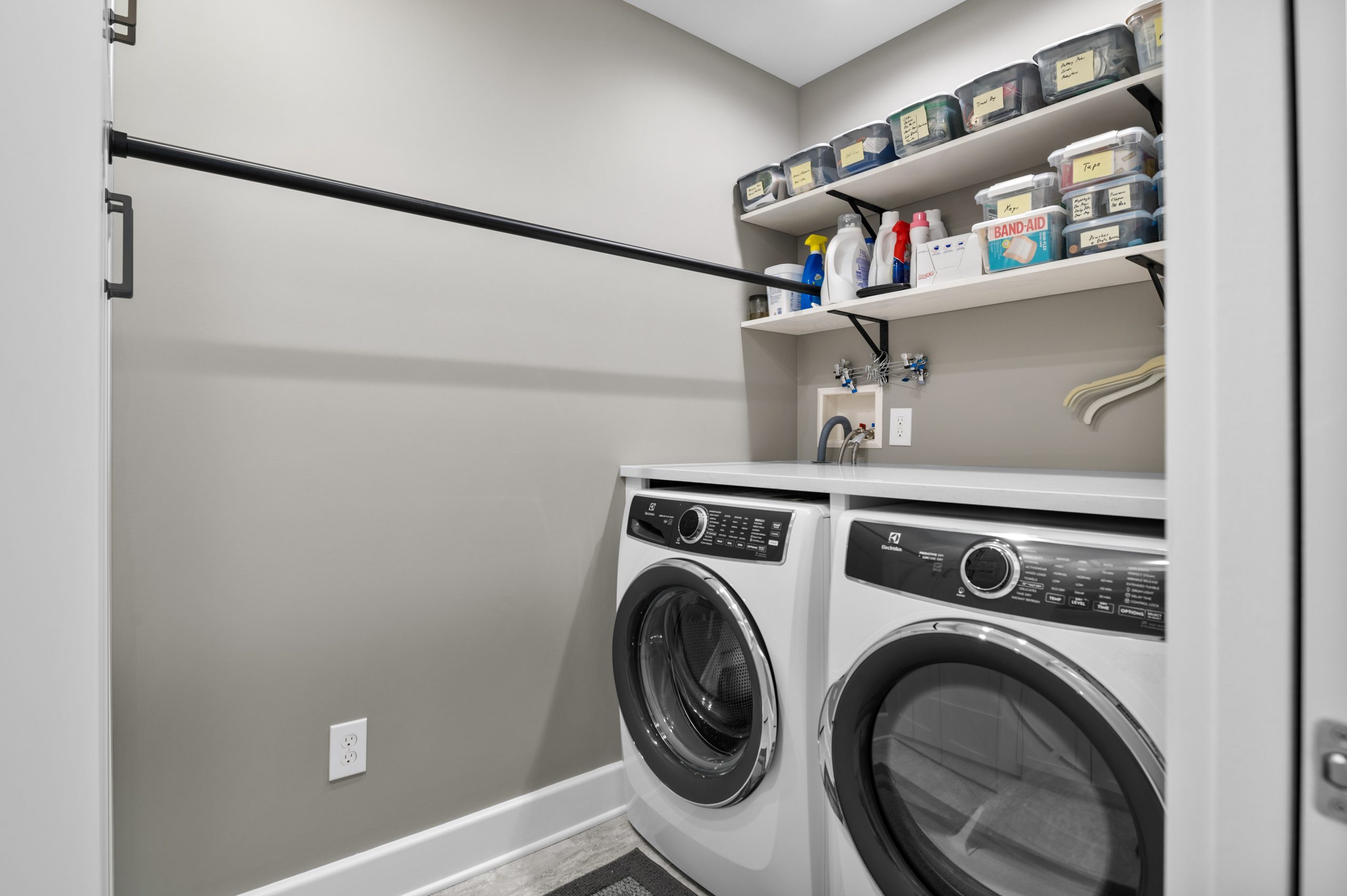
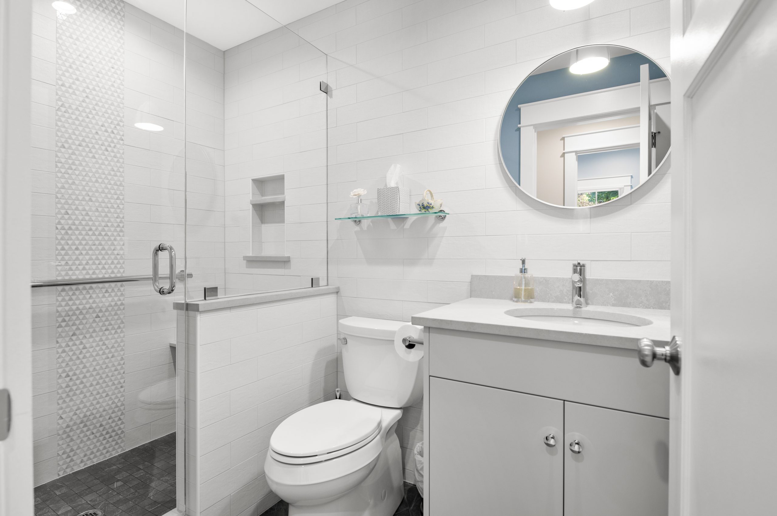
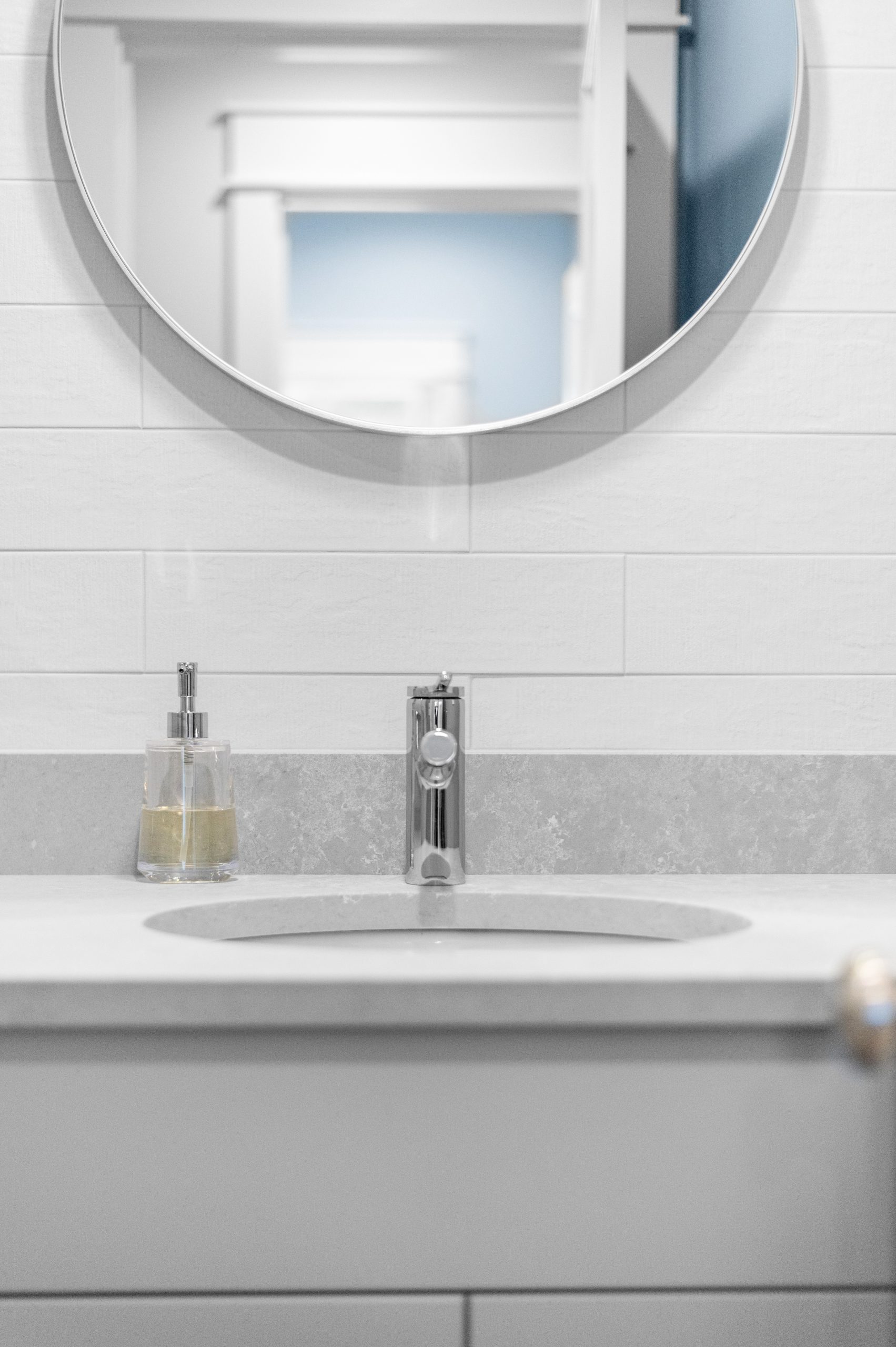
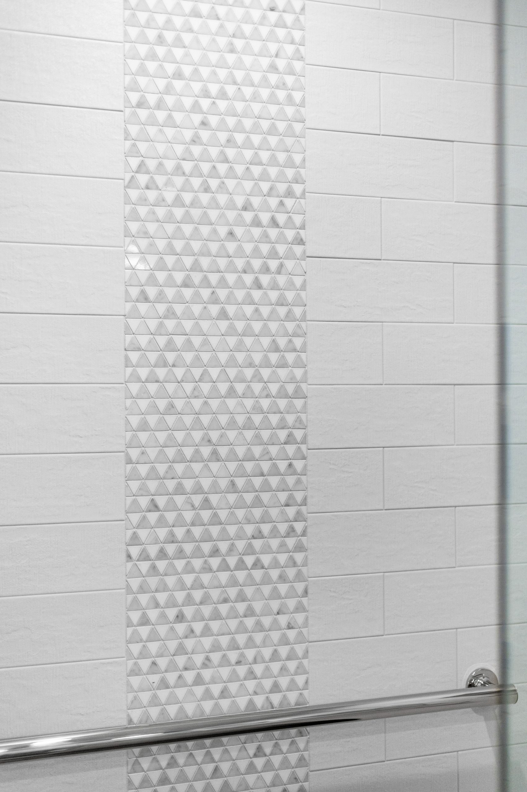
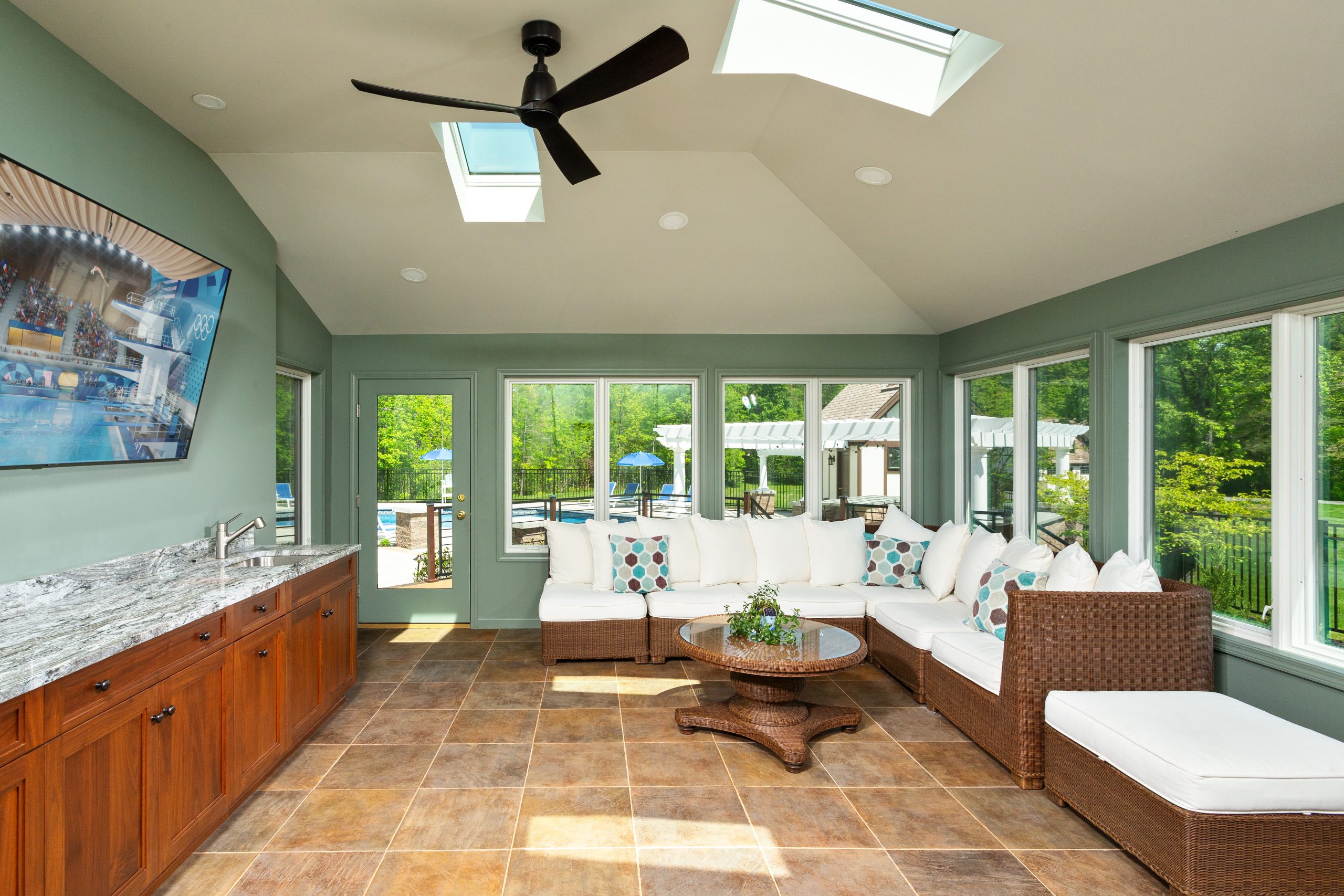
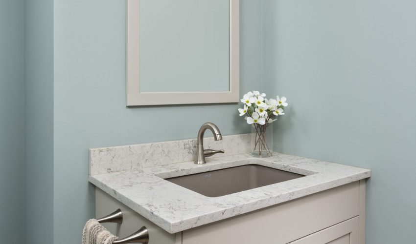
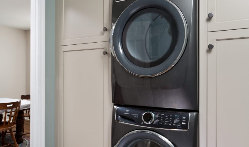
This expansive project included the transformation of a kitchen, laundry room/half bath, and a sunroom. The goals were to give our clients improved functionality in their spaces with plenty of storage, some window and door improvements, and an upgrade to the aesthetics.

The house is an older custom home with beautiful interior trim and other high end finishes. Our custom cabinetry and millwork was the correct fit for this exquisite home, and blended seamlessly with the original parts of the house.

We gave thought to things like low-maintenance exterior trim that will last. Our beautiful custom cabinetry provides great storage and organization solutions for the clients. Note the special details like the built-in table that offers a cozy nook for sharing meals together, and the beautiful kitchen island which extends the working space.

 Our clients were delighted with the finished product, and we know they are making many happy new memories in their gorgeous renovated spaces.


Making Space for Better Living…

One of the best things about a renovation is that it allows us to update the homes we love to work better for our families. The way we live our lives changes over time, and whether we need more space for our growing families, a different layout for entertaining, or better storage and organization solutions, a renovation can simply make life easier.

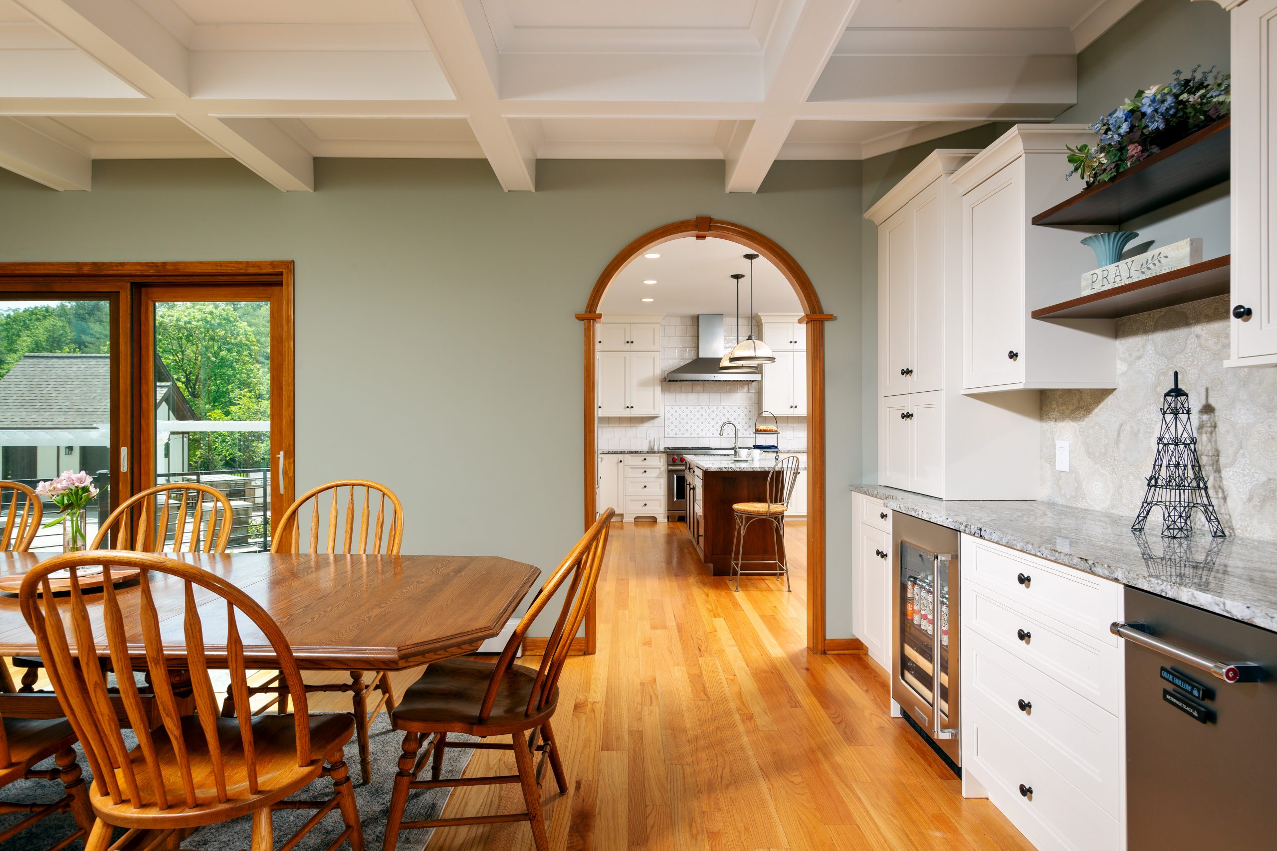
In this case, our clients wanted an open concept floor plan for their kitchen and dining areas, and more functionality for their everyday lifestyle as well as entertaining. We removed a wall between the existing dining room and kitchen to accomplish that goal. We focused on maximizing storage space and work space, most notably in the twelve foot kitchen island. We also included plenty of wall storage, which is a great solution for finding more organizational space in your home.
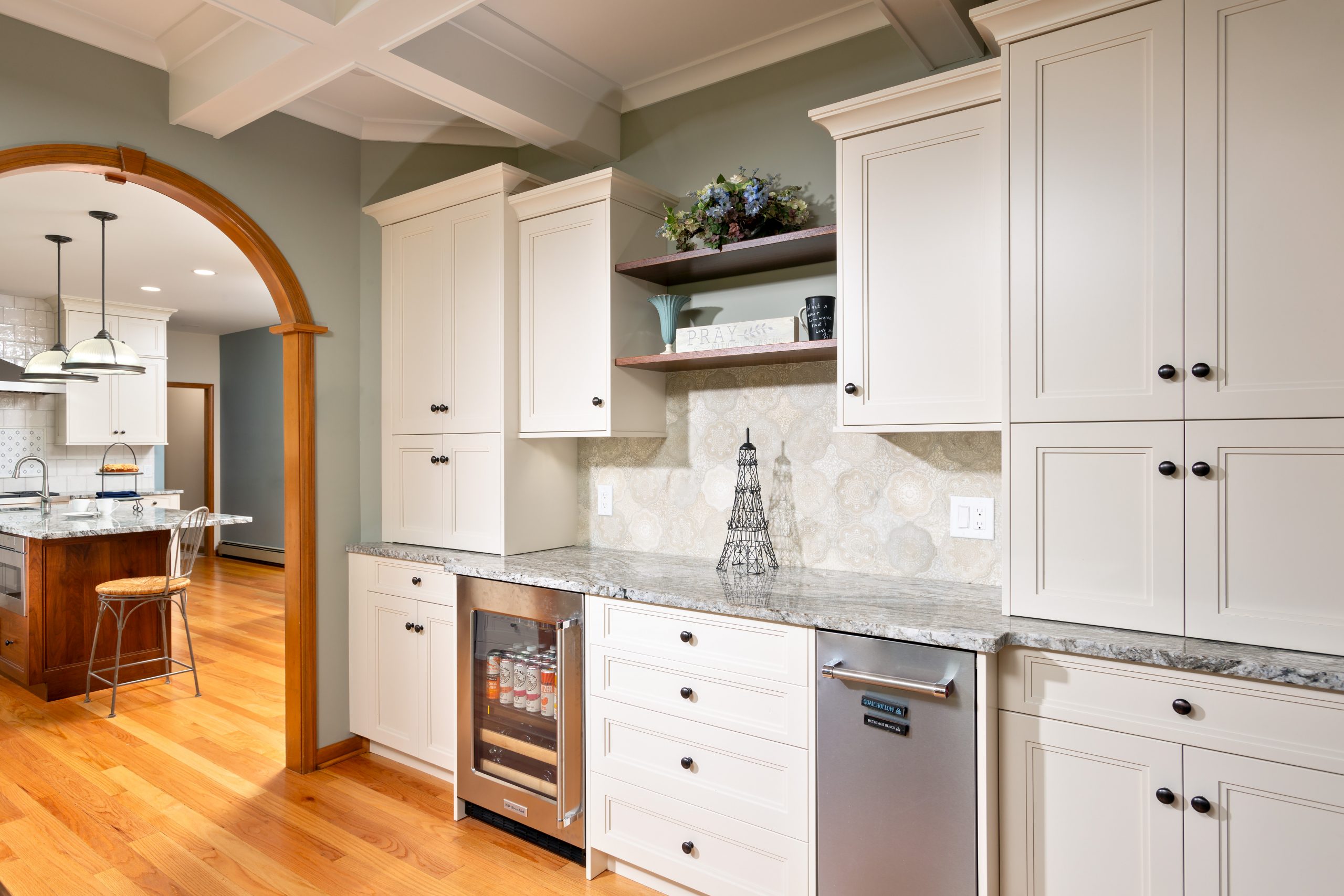
The design choices in color and materials selections gave the project the perfect aesthetic look–clean, crisp, and totally magazine-worthy.

Our clients were wonderful to work with, open to suggestions and collaborative. They are thrilled with their new open kitchen and dining area, and look forward to enjoying it for many years to come with their young family.

A Beautiful New Deck Adds Outdoor Living Space

We like to make the most of our temperate seasons here in upstate New York, and time spent relaxing or entertaining on decks and porches are some of the best ways to enjoy spring, summer, and fall. While we find ourselves in the thick of winter, let’s go behind the scenes of this deck renovation and daydream of sunnier days to come.

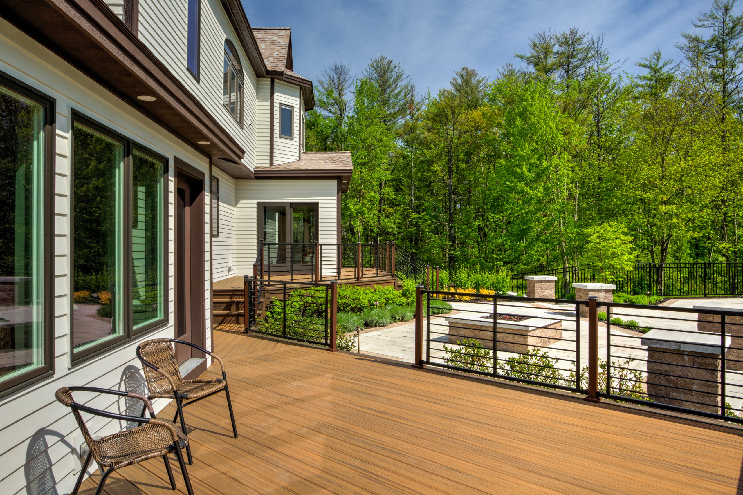
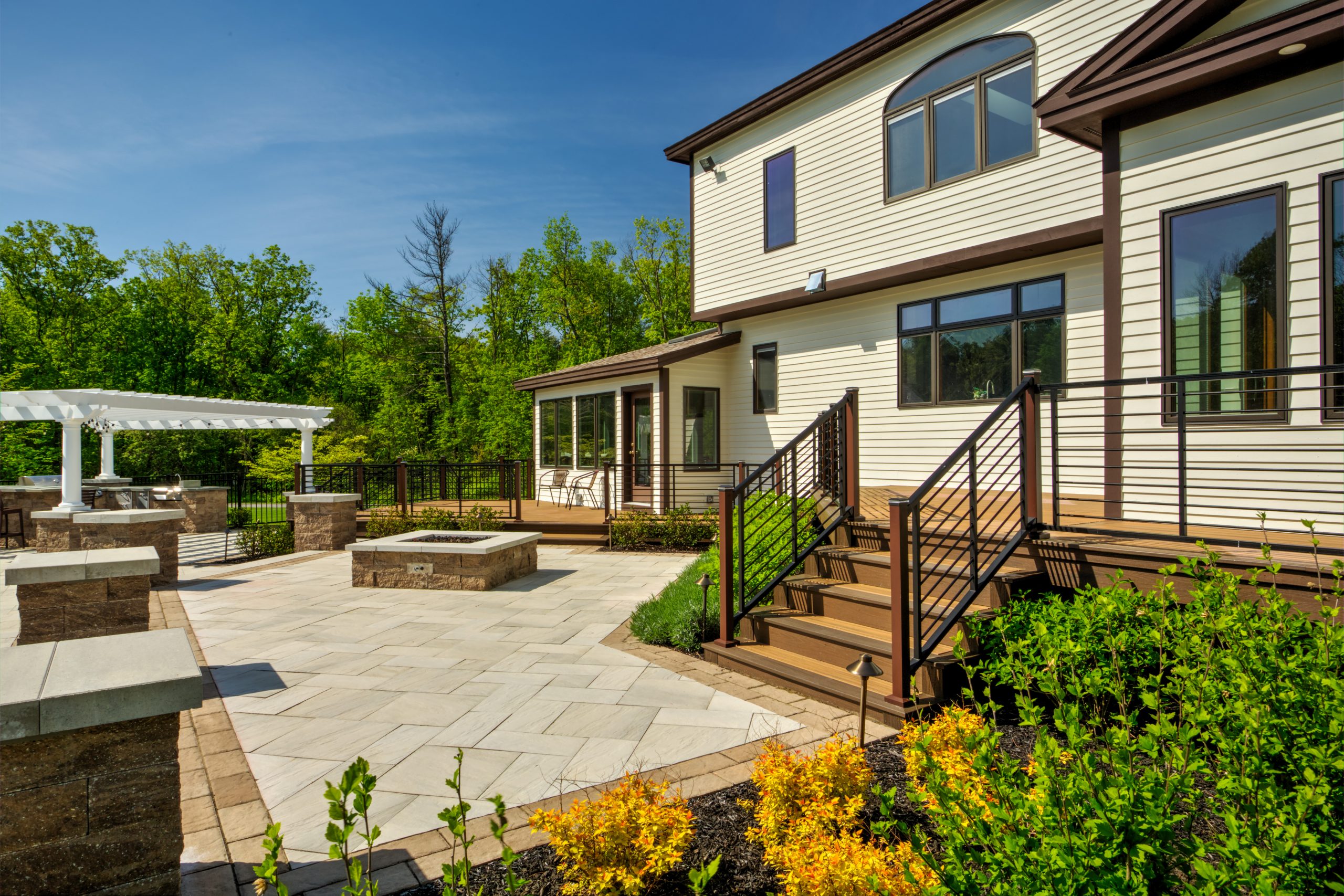
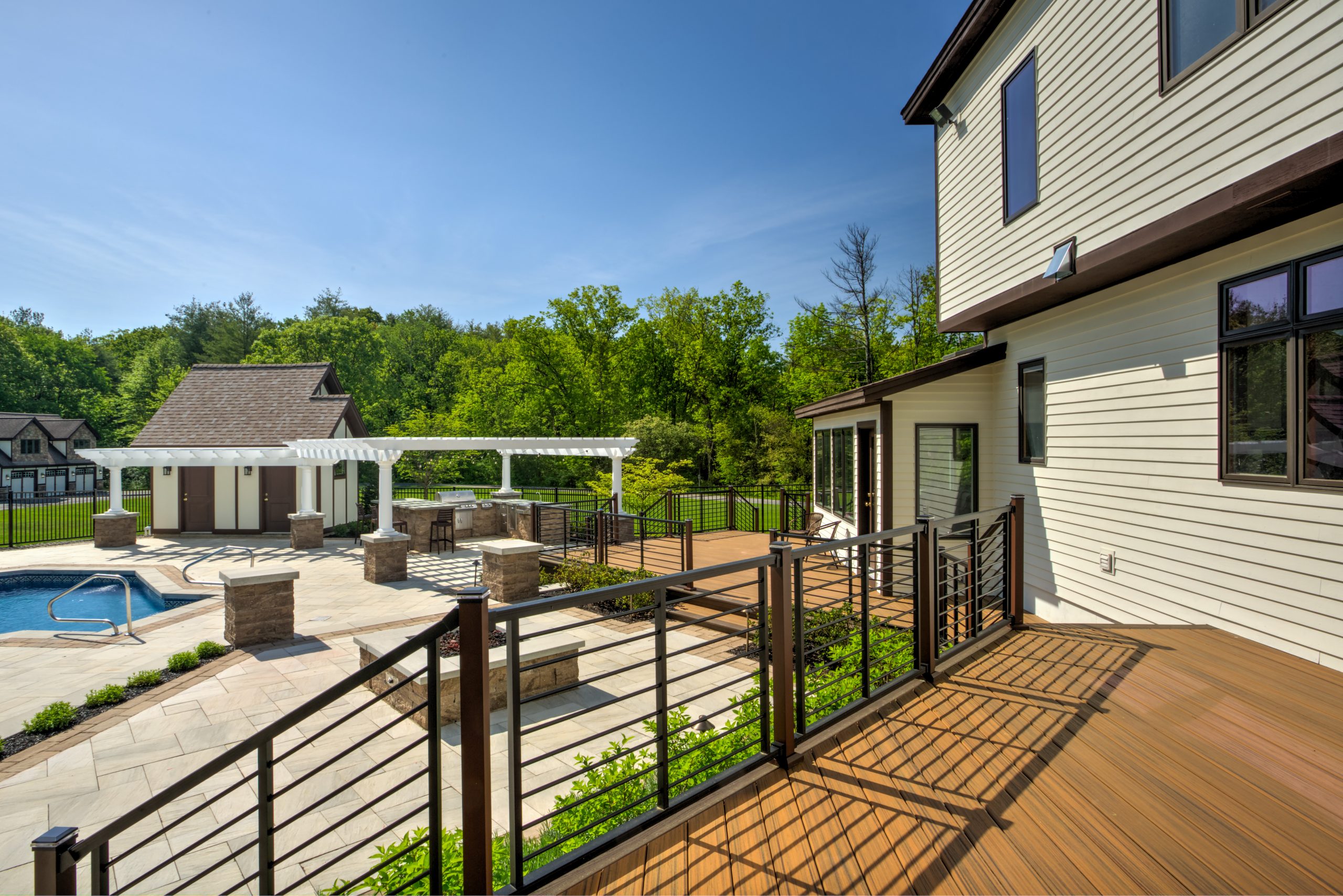
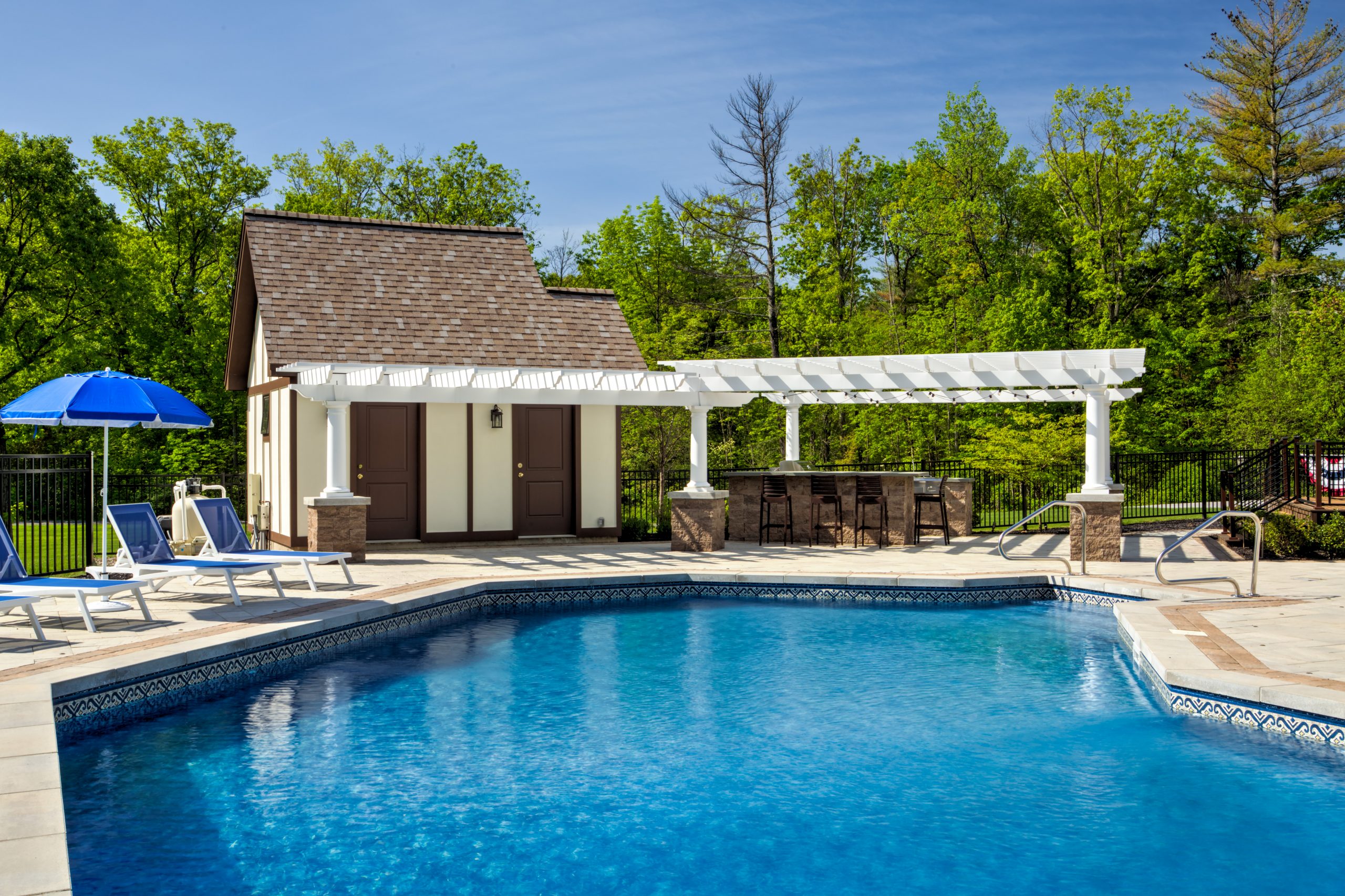
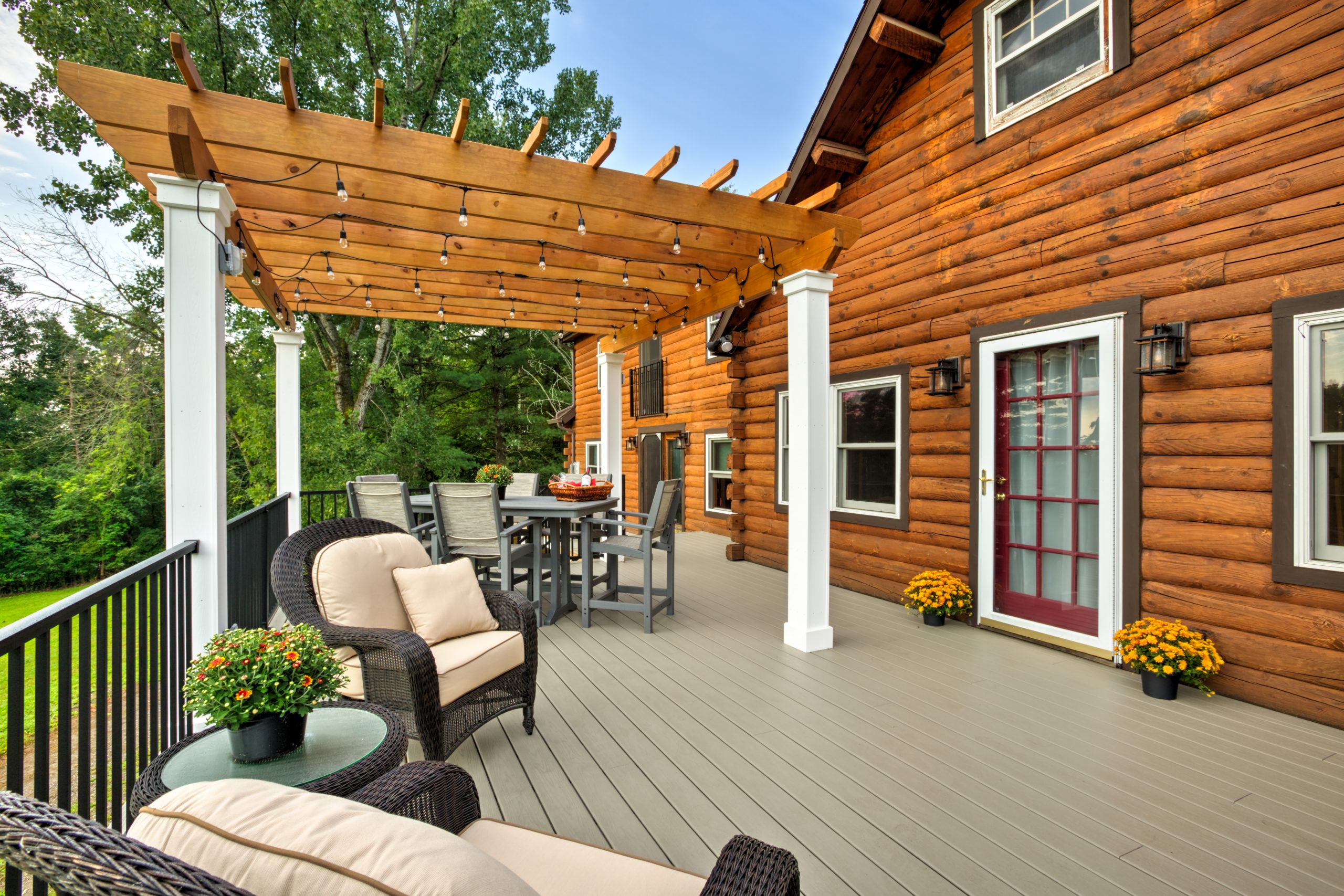
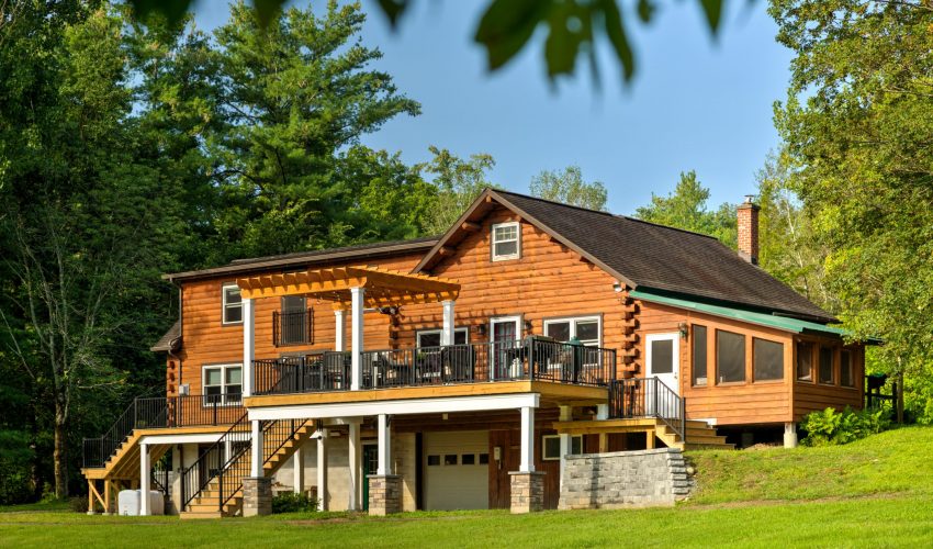
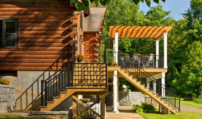
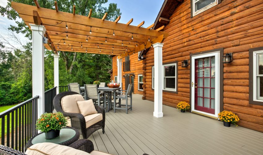
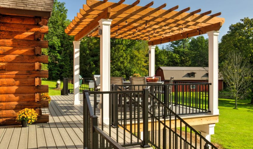
For this project, we removed a weathered, treated deck at the back of the home, and built a new deck with composite decking, aluminum railing, and a new pergola.

We added quite a bit of square footage, additional access points, and removed a second floor balcony while updating the look of the entire back of the home.

The back of this house includes a walk-out basement, and the area beneath the existing deck included a concrete slab that we needed to work around. The size and scope of this deck project was considerable, which required expert planning.

The black aluminum rail work really pops against the composite decking, and the project created so much usable space for the clients to entertain their friends and family.

Our clients thoroughly enjoyed their first season with their new, expansive outdoor living space, and we know they’ll continue to enjoy it for many years to come.


An Extensive Renovation That Feels Like a Brand New Home

Some home improvement projects simply feel like an upgrade. And some feel like a transformation so dramatic, its hard to believe the “Before” and “After” reflect the same home.

In this Project Spotlight, we’ll go behind the scenes of an extensive, multi-room renovation that is fresh, updated, and modern.

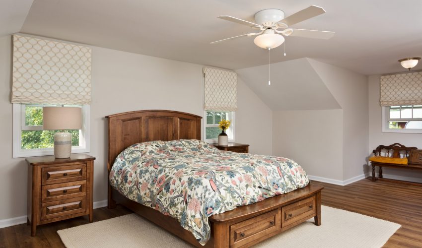
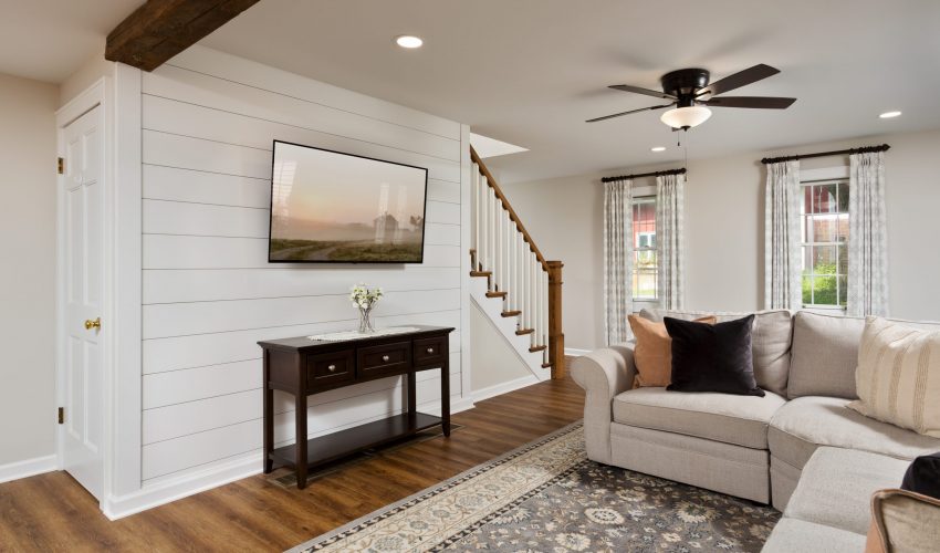
This project included the remodel of our clients’ kitchen, first floor bathroom, laundry room, family room, and the primary bedroom on the second floor. The homeowners were ready to update the décor and also create more kitchen space for better functionality during family gatherings.

We partnered with an architect to consult on the structural changes involved in the project, particularly for the removal of the bearing wall between the kitchen and dining room.

Our design team did a wonderful job of pulling all of the materials and colors together, which created a cohesion between all of the many renovated spaces.

The transformation is nothing short of spectacular, and our clients are absolutely thrilled with the end result.

This Project Spotlight beautifully highlights the many possibilities renovation allows for clients who love their home and their location, but want to revamp their living spaces to better fit their lifestyle and design preferences.

It’s all doable, and we’d love to show you how! Reach out to us today if you’re ready for a new reality in your existing home.
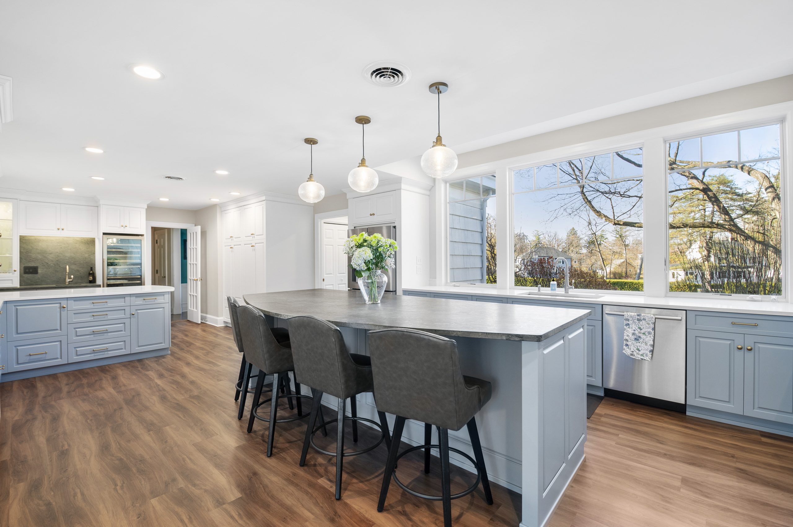
A Gorgeous New Kitchen for Longtime Clients

We are honored when our clients turn to Schrader and Company for repeat projects, sometimes over the course of multiple homes. That was the case in this Project Spotlight, in which we undertook a kitchen renovation for clients we have loved working with over the years, on many different home projects.

For this kitchen renovation, our clients didn’t need an expanded footprint so much as some spacing changes that would improve the room’s functionality for their lifestyle.

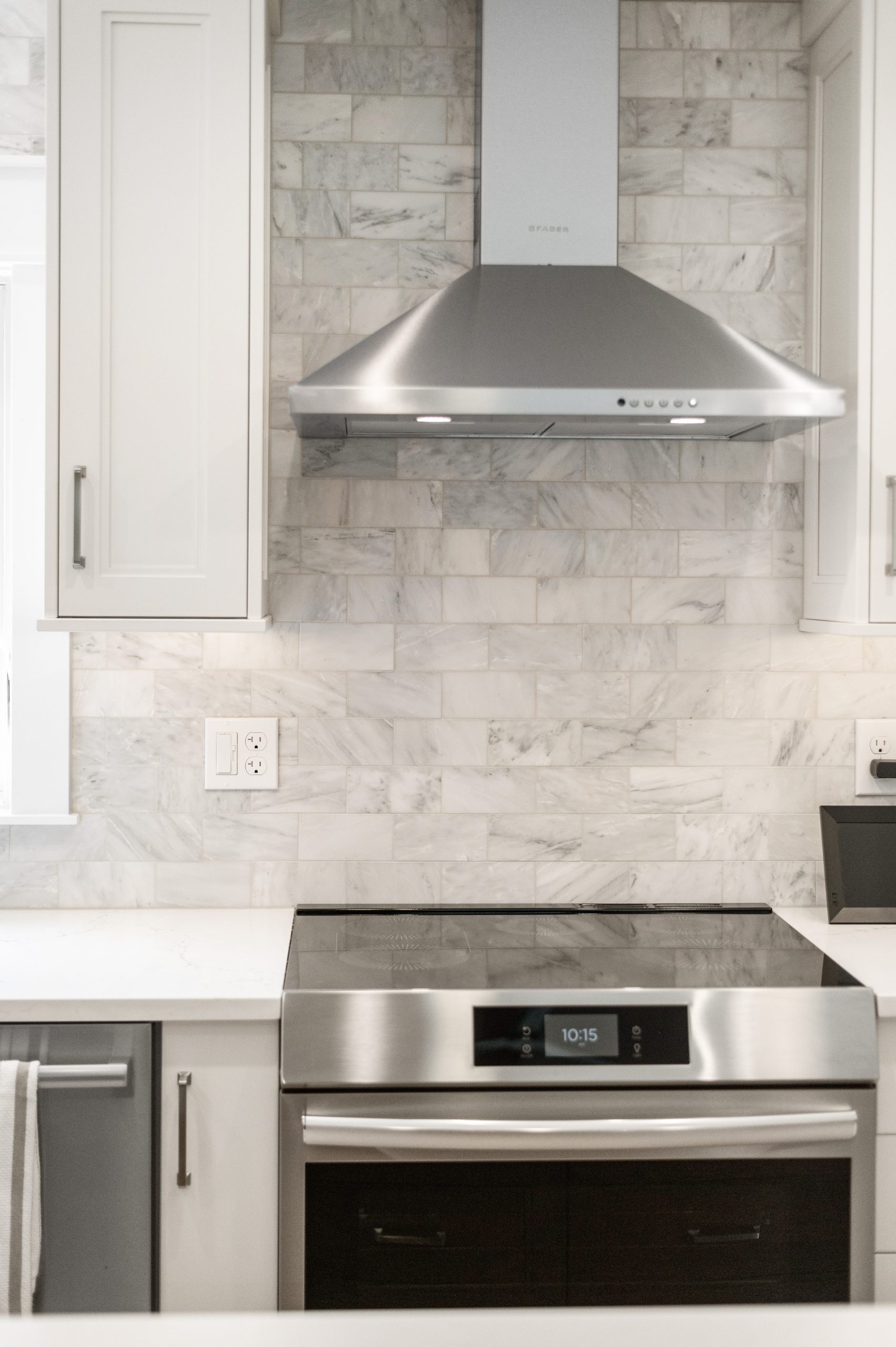
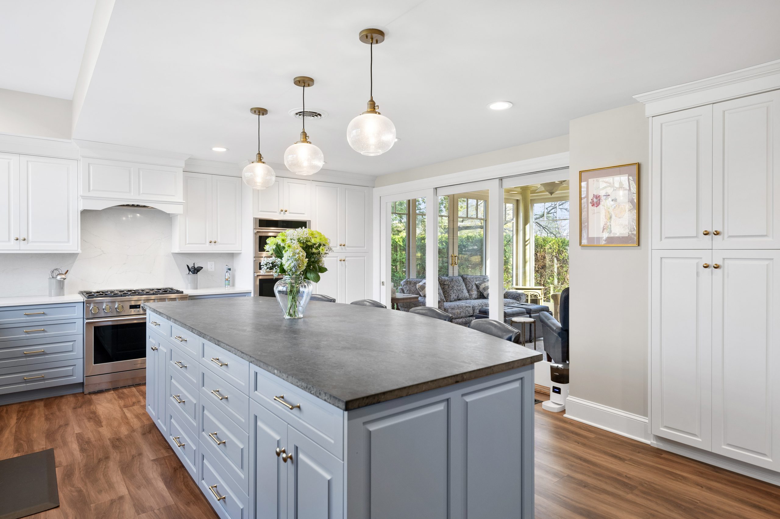
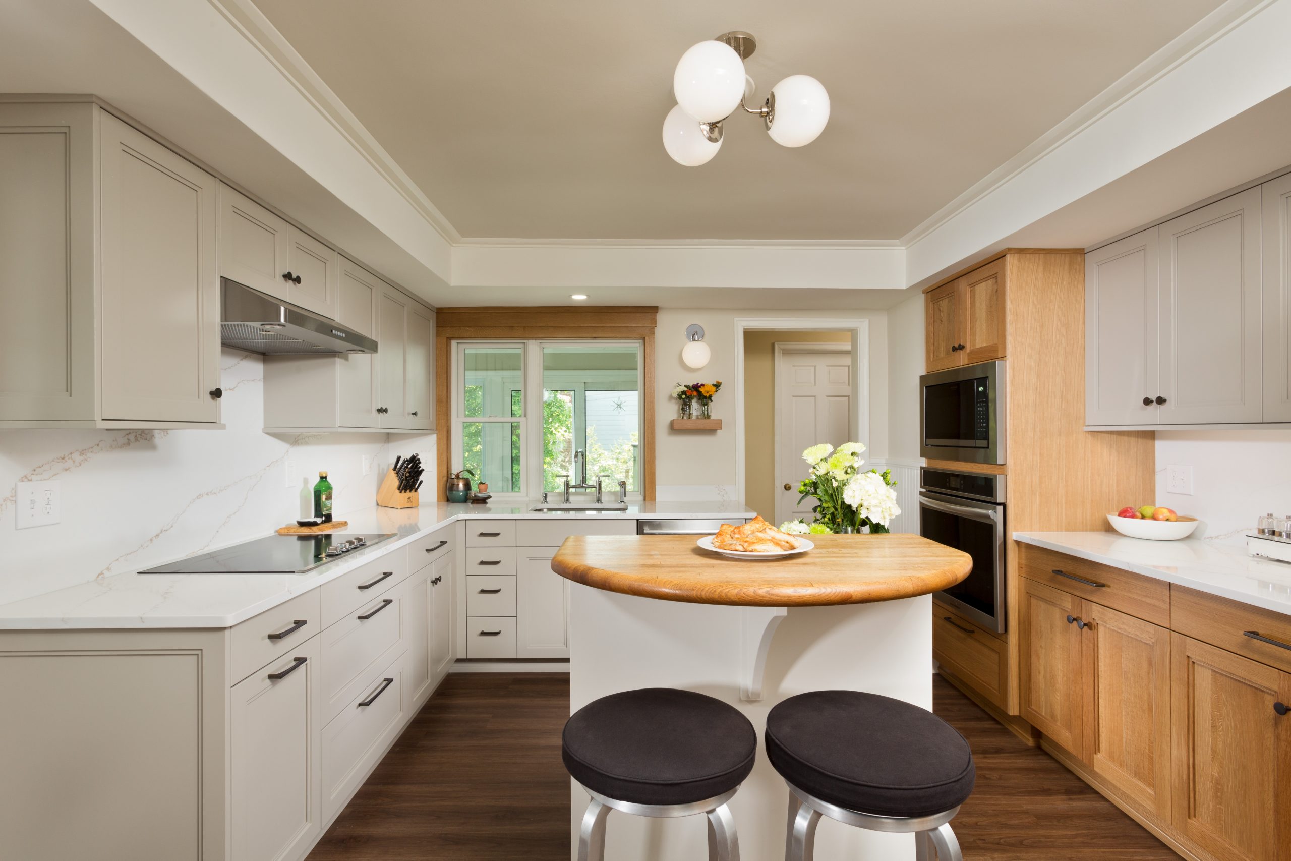
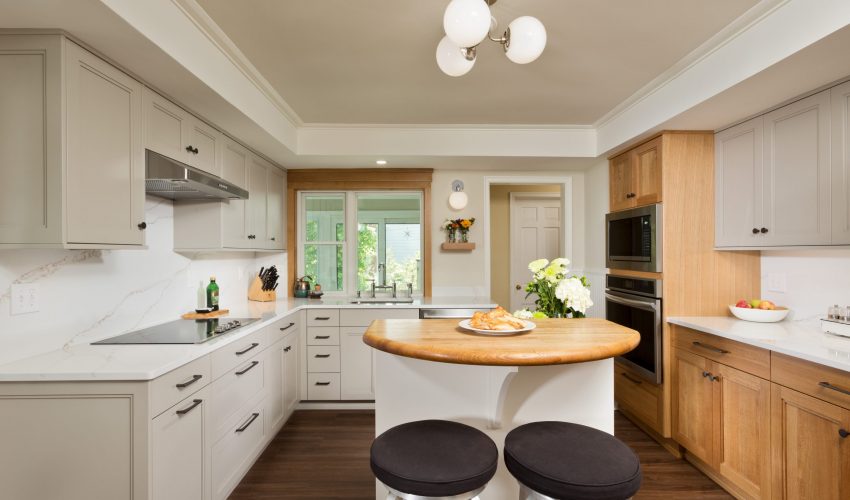
In addition to moving appliances to create a new flow, we installed new custom cabinets with quartz counters and full-height quartz backsplashes. We put in a new window unit, new appliances, and new luxury vinyl tile flooring. We built the new cabinets to the existing soffit at the ceiling perimeter, which the clients wanted to preserve. Custom moulding at the higher center portion of the ceiling adds visual interest.

The existing kitchen island remained, and interestingly, is a custom Schrader and Company creation that we built for the previous homeowners.

The mixture of painted and white oak cabinets is a beautiful design touch, and the thoughtful placement of the appliances gives the room a great flow for both cooking and entertaining.

It’s an absolute pleasure to collaborate with these longtime clients, and we are thrilled that they trusted us to bring their vision for their home to life once again.

The Latest Trends in Kitchen Design

We recently asked our in-house designers Brooke Weinert and Kara Woitkoski to share some of the latest in kitchen design trends. From mixed metals to clever organization systems, read on to learn more details and see photos of how these design elements can be incorporated into your home.
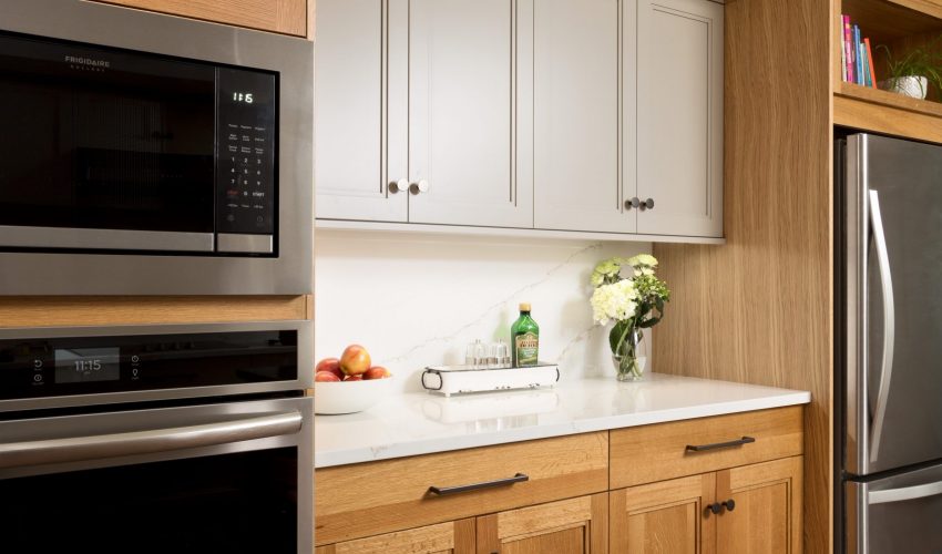
  • Use of Walnut Interiors:

We’re seeing an increase in people wanting more of an accent and contrast at the interior of their cabinetry. While this is a bit more upfront cost, it’s an irreplaceable and gorgeous look and immediately adds visual value to kitchens of all colors and tones.

  • Mixed Metals for Cabinetry Hardware (and elsewhere!):

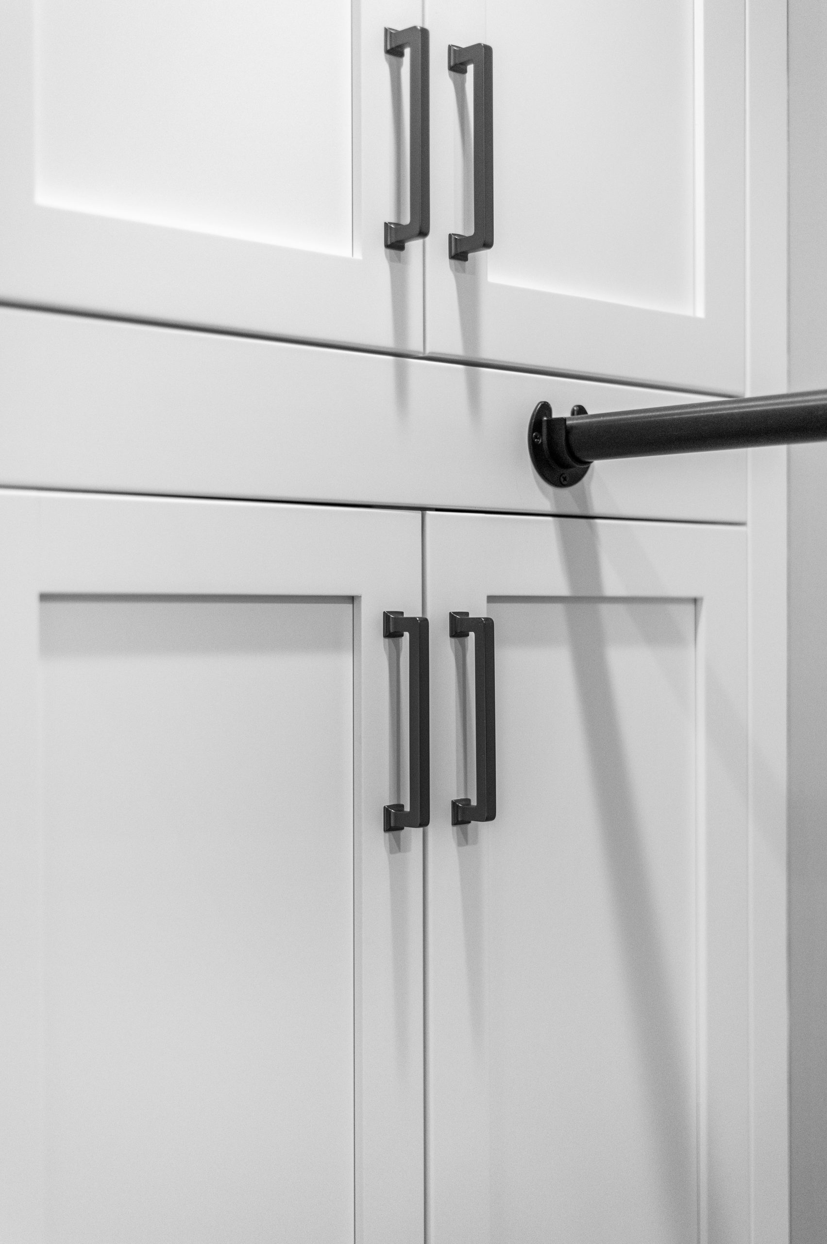
Rather than sticking with one finish, we think there will be an increase in the use of mixed metal tones. The use of a darker backplate with a brass or pewter pull can really make hardware a statement. At the same time, we’re seeing the islands being used as a place for statement hardware. For example: we may use a satin brass knob at the perimeter cabinetry, but select a larger, more decorative cup pull in a more antiquated finish for the island as a feature. This makes the island stand out and feel more like a furniture piece. In addition to the cabinetry hardware, we’re seeing this spread to other areas of the kitchen as well. We’re no longer selecting one finish for the entire kitchen, but truly allowing the hardware, fixtures, and lighting to all complement each other in different tones. This makes a space feel much more unique and thought out, rather than just selecting the same finish for everything.

  • Door Details:

For the past few years, the most popular door styles were all flat panel or “shaker” style. But the tide is shifting! Lately, we’re seeing more interest in decorative door styles being used in a more contemporary way. We’ve been using more raised panel door styles and even some flat panel doors with applied molding. These door styles are gorgeous and create a unique, boutique look.

  • Organization & Space Savers:

This will never go out of style, but certainly ebbs and flows with all other “trends”. Lately, people are focused on optimizing space and becoming more organized. All of our kitchens are custom designed to be functional and fit our clients’ needs, but sometimes we’re able to take it even further. Using custom drawer dividers, dish storage pegs, spice bleachers, custom filler rollouts, and (for those who hate lazy susans) blind corner optimizers! We’ve been seeing even more interest than we typically do in going the extra distance to ensure every inch of the kitchen is going to be utilized.

  • Two Tone (or more!):

Our clients love the opportunity to incorporate more than one cabinet tone (and so do we!). We’re very much used to doing two tone kitchens. But lately, we’ve seen people incorporating three tones in one space. We think that when it is executed well, it’s a gorgeous look. We have a kitchen coming up that is using a beautiful cream tone for the upper cabinets, a truffle brown for the base cabinets, and a walnut island and we cannot wait to see it all come together.

Check out the slideshow for examples of some of these kitchen design elements in our projects!


Design Trends We’re Loving Lately…

We asked our brilliant in-house designers Brooke Weinert and Kara Woitkoski to share some of the best recent design trends they’re seeing in the industry today. This thoughtfully assembled list can help inspire and guide you as you look to make selections for your own home projects.

As always, Brooke and Kara are here to help bring your interior design visions to vivid life!

  • Larger Fixtures (in lighting & hardware specifically):

Larger Light Fixtures and hardware with texture or complimentary colors are huge right now. They’re being used more as statement pieces, which we love!

  • Textures (in backsplash, countertops, cabinet doors, etc.)

We’ve seen a decline in true square edge backsplash tiles and a rise in tiles that are handmade or look handmade, bringing in more character and texture with perfectly imperfect edges. It brings a much more natural and welcoming feel to any space. We’ve also been seeing more interest in mesh or metal panels in cabinet doors to bring a more interesting and detailed style to their homes. 

  • Color in Cabinetry

We have seen a lot more color being introduced in cabinetry, which is so much fun! We’re seeing a big increase in “natural” colors, like stone, slate blues, tonal greens, etc. While we love a classic white kitchen, it’s such a fun opportunity to work with color more frequently. This year specifically, we’ve had multiple clients who want to steer away from an all-white kitchen, saying it doesn’t feel “warm or homey” enough for their preference. With our recent clients who do want white, we’ve use other tones to support and bring warmth to the space; be it a wood island or two tone cabinetry to make it more interesting and welcoming.

  • Command Centers

Almost all of our kitchen projects lately have requested a “drop zone”, better known as a command center. We think with getting back into our normal, pre-Covid routines, we’ve also gotten back to our old ways, which means everything ends up on your kitchen counters! We don’t love that, so we like to design a designated area for all the little things from chargers for your phones, to organizing mail. We’re doing our best to help families stay more organized and keep their clutter out of the kitchen.

  • Tile and Wood Alternatives

While loving the look of tile flooring, people are wanting lower maintenance and more wallet-friendly options. Luxury Vinyl Tile (or Plank), known as LVT or LVP, has become extremely popular. They can give you the look of tile without the grout, while being much more forgiving on your body and joints. They can also replicate natural hardwoods, without worrying about scratches, water damage, or seasonal movement.

  • Natural Countertops

While we love the virtually zero maintenance quartz countertops, we have recently (surprisingly) seen a big comeback of natural stone countertops. Despite the fact that they require more maintenance and care, our clients have been consistently steering towards granites, soapstones, and even quartzites! They are made from the earth–a snapshot of a moment in time–and each slab is completely unique and one of a kind. That is tough to beat!


A Dramatic Renovation That Feels Like a New Home

A well-planned and well-executed renovation can sometimes be so dramatic, the end results feel like a completely different home!

In this Project Spotlight, we take a look behind the scenes of an extensive remodeling project, covering two floors and multiple rooms.

The goal of the renovation was to create spaces that better worked for the family and their lifestyle. The clients had outgrown the existing space, and they wanted to update the aesthetic in the kitchen especially.

We renovated a large portion of the first and second floors of the home. On the first floor, we renovated the kitchen, mudroom, dining area, and parlor. On the second floor we removed the master bedroom and master bathroom. This space was rearranged to create two bedrooms and a main bathroom. We then removed the roof from the existing garage and created a new master bedroom suite.
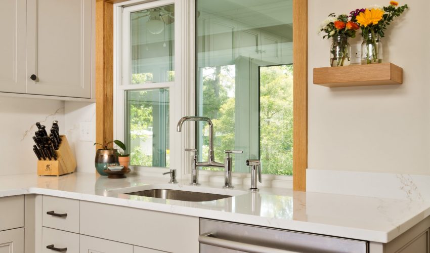
The kitchen/mudroom space was opened up to create a better flow. The transition of each area as well as the finishes that were chosen are spectacular.

The difference between the original and finished spaces is nothing short of amazing. It almost feels like a different house altogether.

Our clients are so happy with their renovated home, and we are beyond gratified to know the project came together in such a satisfying way for everyone involved.


Seamless Updates to a Historic Charmer

Schrader and Company is a construction firm comprised of history lovers. We take pleasure in the beautiful details of older homes, and relish in the challenge of updating them for our clients in a way that makes modern living more effective and enjoyable, while paying homage to the aesthetics of yesteryear.

In this Project Spotlight, we return to a gorgeous 200 year-old home owned by repeat clients for an extensive, multi-room renovation. 

Last time, we renovated an upstairs bathroom to better suit our clients’  lifestyle and modern needs. 

For this project, we removed a large deck, removed the old mud room, and took off two exterior walls and framing for the back part of the house. We then built a new mudroom, enlarged and renovated the kitchen, and opened the connections to the rest of the house. On the second floor, we enlarged the hall, added a second story laundry closet, and replaced the small existing craft room with a large, light-filled room to be used as a craft room, guestroom, and office.

The goal was to add onto the home in thoughtful ways that would enhance our clients’ lifestyle. We created a larger kitchen so that the whole family could be involved in their daily meal time activities. The spacious and organized mudroom replaces an unheated porch, providing designated space for boots and backpacks, and more comfortable comings and goings for people and pets. The new screened porch allows the homeowners to more easily enjoy their property, and entertain. The craft room updates enhance a needed at-home work space, and provides a comfortable space for guests as well.

As with any historic renovation, attention must be paid to the smallest of details to create a cohesive look between the original parts of the house, and the new. Choices like wide plank wood flooring and porcelain, brick tiles help achieve this goal, as do many of the other thoughtful design selections.

At the end of this extensive project, we were able to design, specify, and build an addition to this historic home that looks as though it was a part of the original build, and it is as functional as it is beautiful.

Our clients had this to say about their newly-renovated home:

“From the structural design down to the smallest details of cabinetry and trim, our Schrader team took time and care to do their best work at each step. We chose them for our project because it was clear that they understood the construction in our 200-year-old home, and our project planner excelled at looking at both the big picture goals and the smallest details during the planning phase. What we learned through the construction process is that the whole Schrader team is not only hardworking and talented, they are also kind, trustworthy, and easy to be around, which makes a huge difference when you have people coming in and out of your home every day. At the end of a months-long project, we are left with a new section of our home that is beautiful, functional, and will last for generations. We are also left with positive feelings about the process and the people. It is clear that the Schrader crew keeps their motto at the core of their business. It was a pleasure and a privilege to work with a talented team and know that we were getting the very best for our home and our family, both in terms of product and process.”