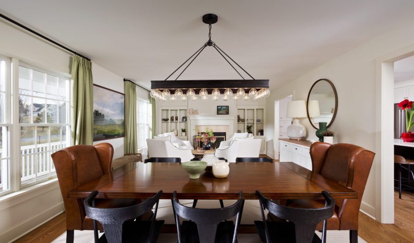
Go With the Flow

Sometimes the right renovation project doesn’t aim to vastly alter the size of a space, so much as make better use of it for the homeowners.

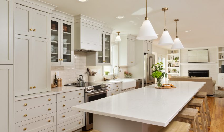
This was a key element of the kitchen renovation for these clients, who found that their original cooking space left them continually bumping into one another when trying to prepare a meal.

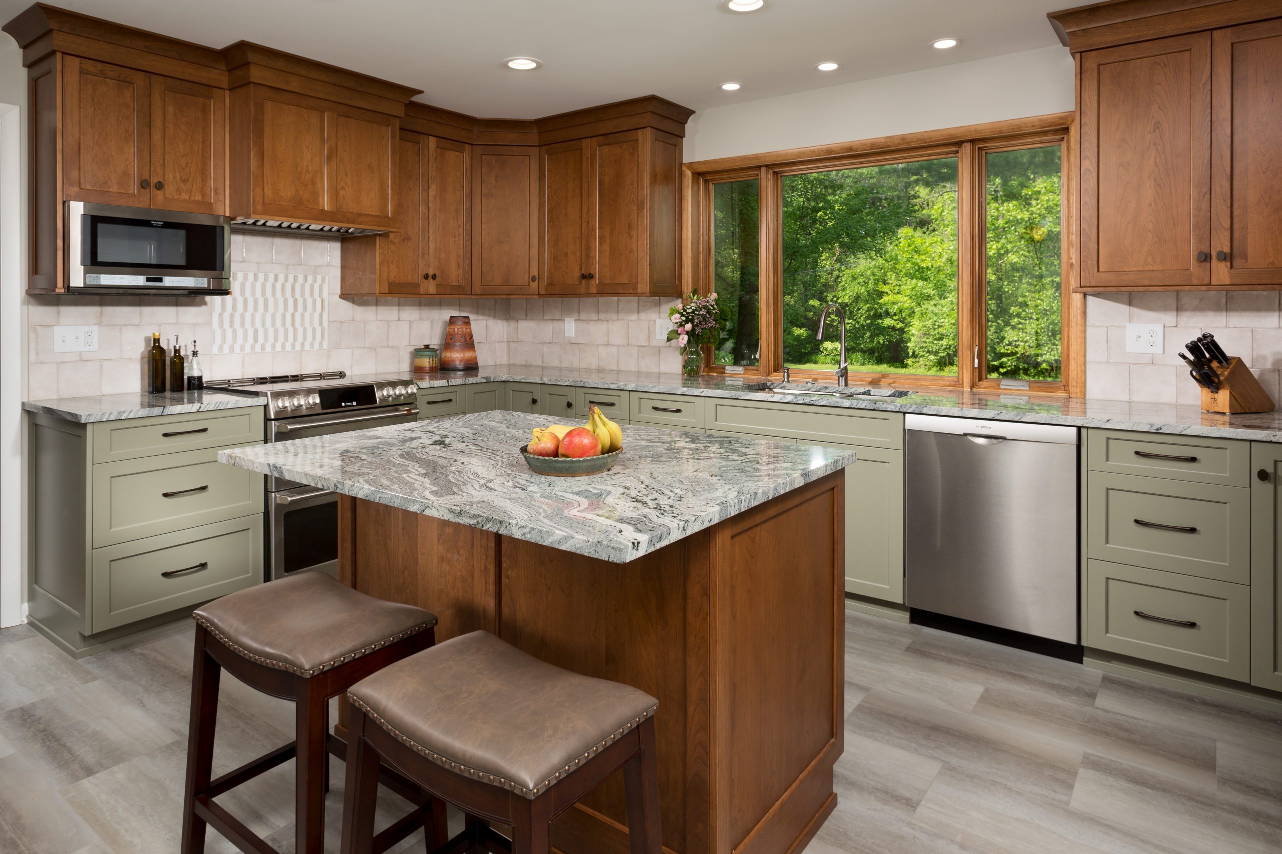
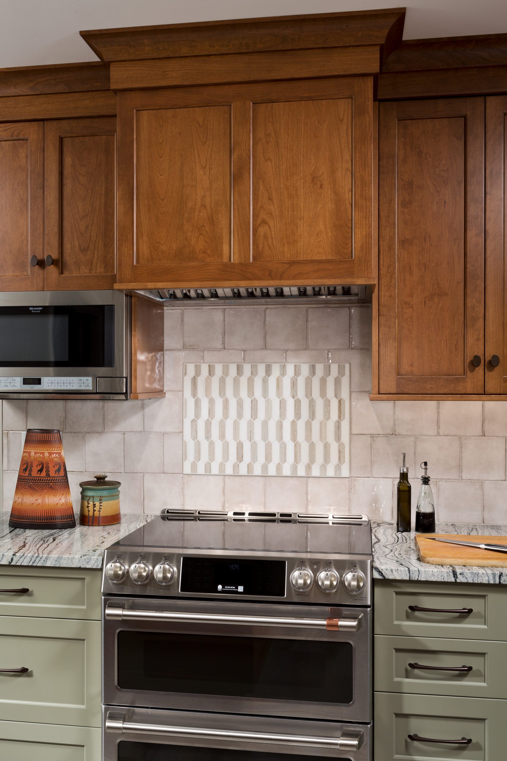
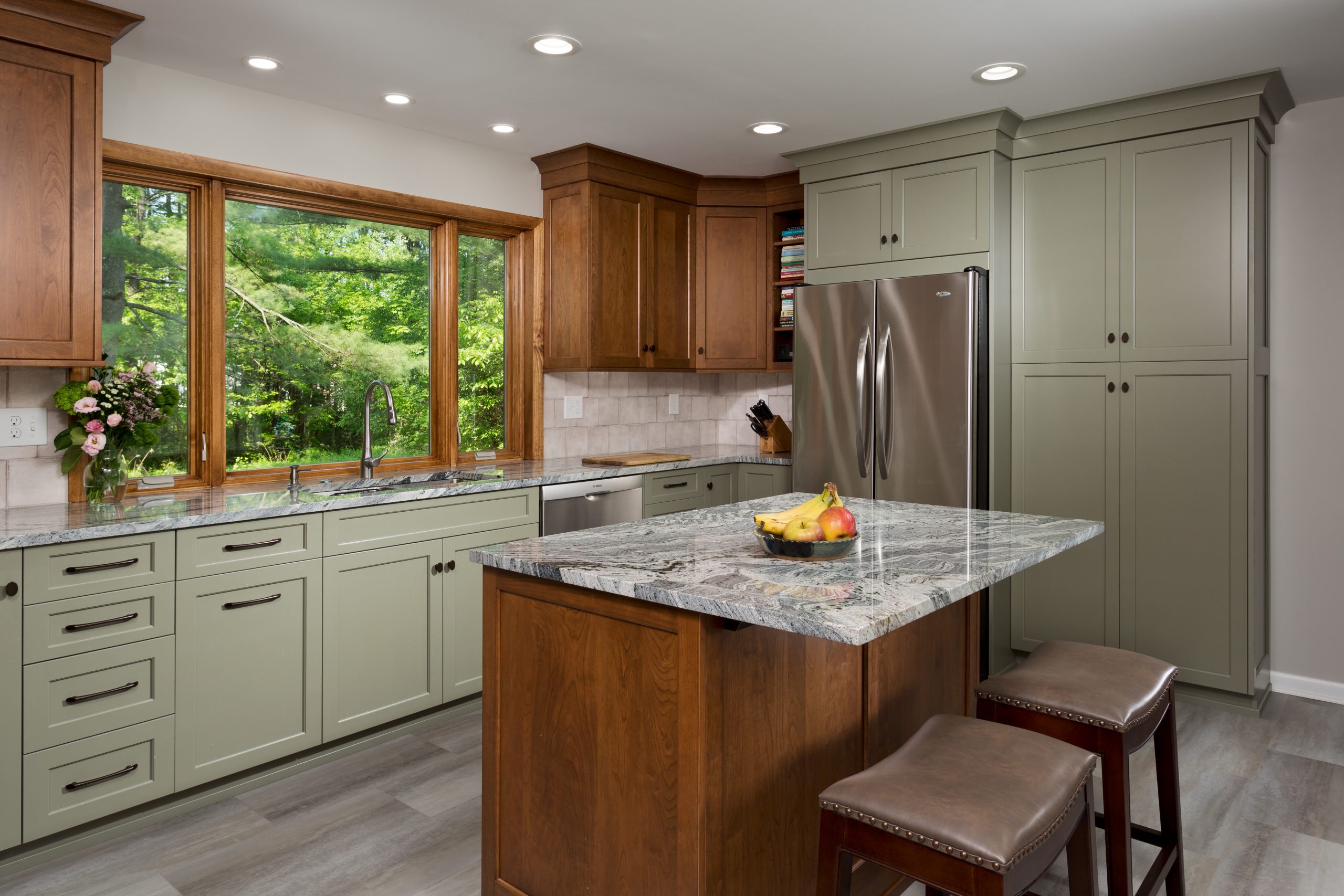
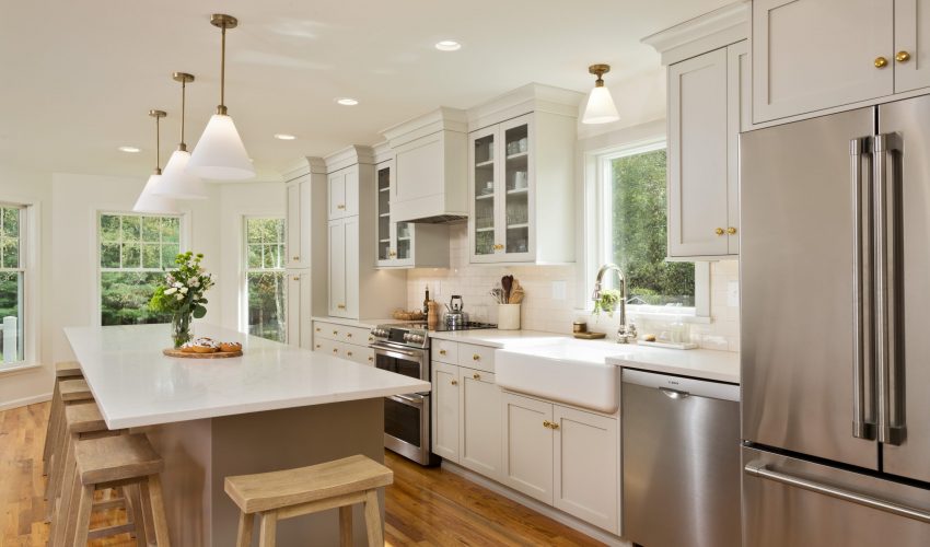
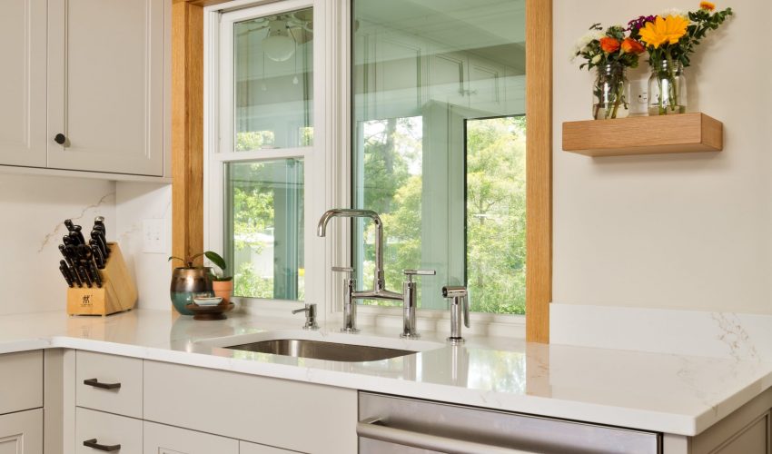
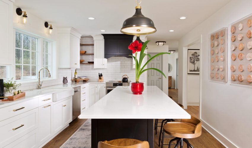
To give the homeowners more room to work and enjoy their kitchen, we changed the orientation and traffic flow of the room. We removed an eat-in table and added a kitchen island, which offers additional counter space and seating. We repurposed a salvaged patio door and moved it into the dining room, which creates a better traffic flow pattern. We also replaced the existing kitchen window with a much bigger window, optimizing the view, and giving a sense of openness and light to the space.

The kitchen also got a beautiful design upgrade, with custom cabinetry in two different, but complementary materials. The new dedicated pantry space, soft close drawers, and luxury vinyl tile flooring all come together to create a modern, sleek, yet warm aesthetic.

Our clients are thrilled with their renovation, and the improved functionality and flow of their kitchen.

A Treasure Trove of Inspiration for Modern Family Living

This Project Spotlight is chock full of innovative design details, space-maximizing transformations, and organizational ideas designed to inspire!

This renovation was very extensive in that we touched a majority of the house. The main goal of the kitchen / mudroom portion of the project was to update the existing Colonial style to a Modern Farmhouse design style, while improving functionality and flow. 

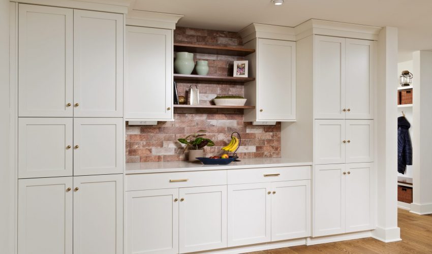
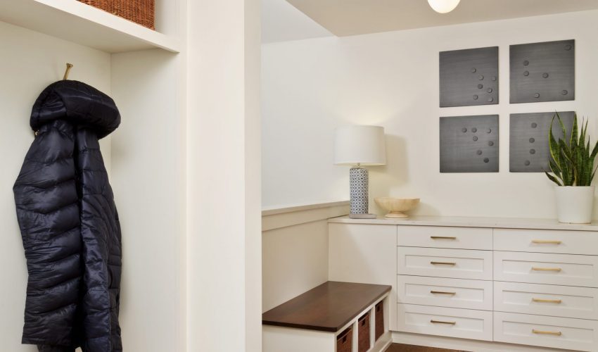
We removed all the kitchen and mudroom cabinetry, countertops, and appliances. We also removed the washer and dryer from the mudroom to increase its size and utility for the parents, children, and pets of the very busy family. A new half bath, laundry room, and work-out / multi-purpose room were built in an existing bonus space.

Any kitchen renovation creates some inconvenience for the homeowners during construction. Happily, we were able to provide a temporary basement kitchen, eating area, and laundry in the interim to minimize the impact on daily life for our clients.

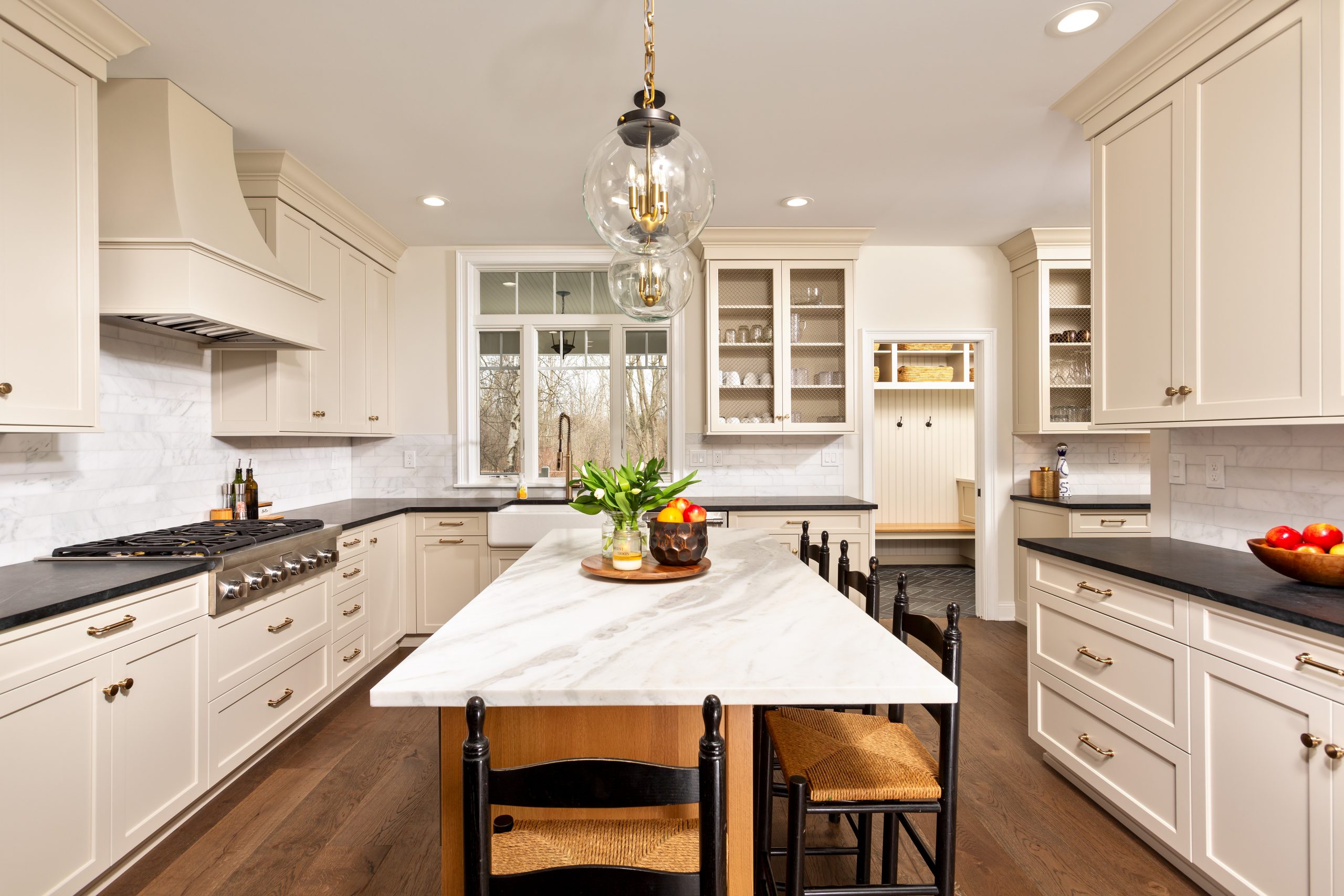
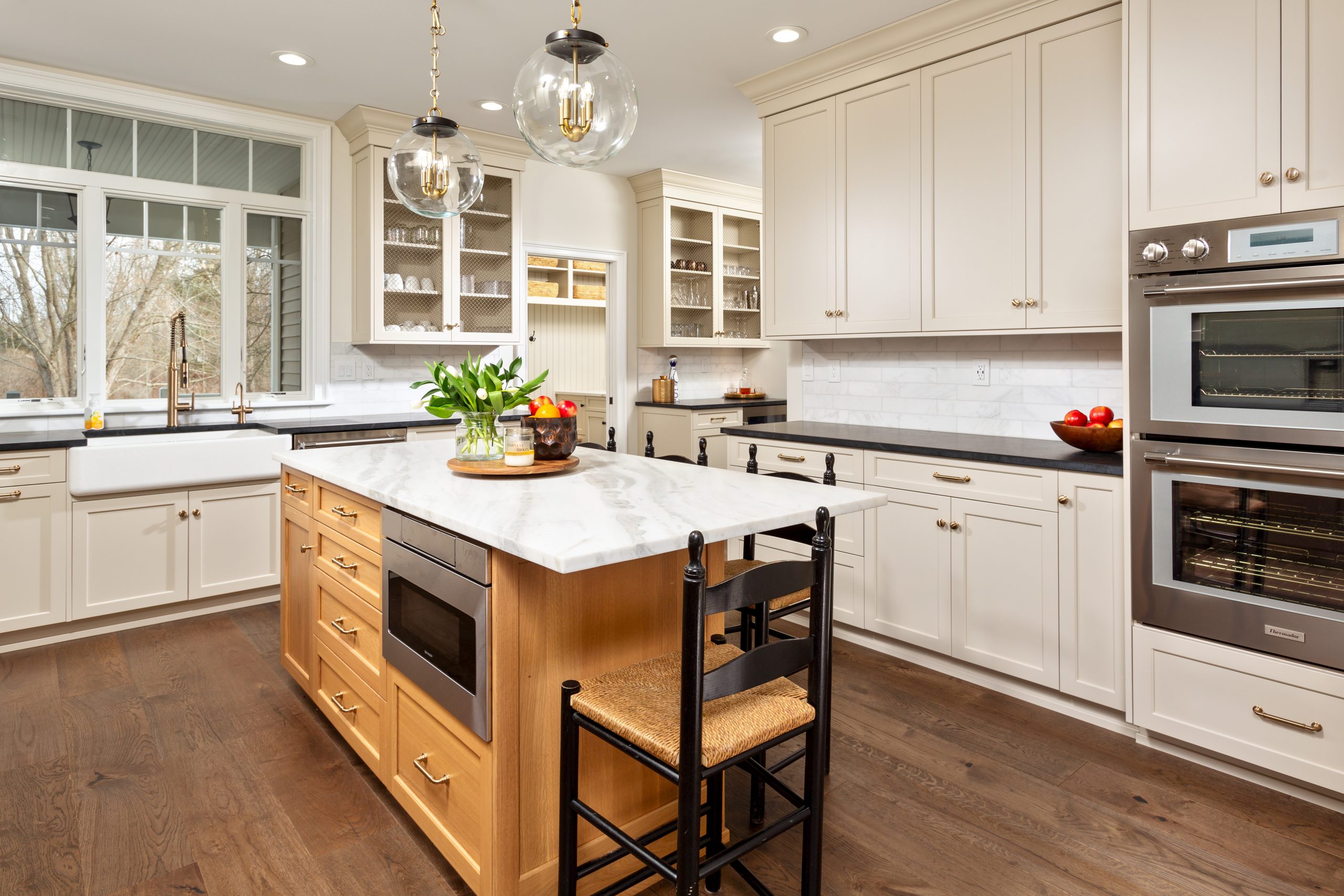
We specified a number of selections that created the updated aesthetic the client was going for. We replaced the existing builder’s grade elliptical transom window with an updated Andersen 400 series unit with a rectangular transom above the sink. We included new natural slate tile in the mudroom, garage entrance, and a marble mosaic tile in the existing first powder room. The rest of the first floor received new wide plank engineered hardwood flooring throughout. We used a gorgeous Kohler “Whitehaven” Farm sink accented with a Kohler “Purist” Semi-professional pull down faucet in brushed bronze. The accompanying InSinkErator “Modern” reverse osmosis faucet in “Brushed Bronze” complemented the space nicely. 

We used many natural materials such as a white marble backsplash accenting the honed black soapstone at the perimeter cabinets. To offset the expansive perimeter cabinetry, we fabricated the large island from quarter sawn oak in a light stain and topped it with a light quartzite top. To add interest, a custom curved exhaust hood and honey bronze knobs and pulls were incorporated, as well as antique brass wire mesh inlaid on some of the doors. We used a number of the same series of fixtures and hardware in the mudroom and laundry, but mixed it up with black finishes and MSI quartz tops. For durability and ease of maintenance, wide plank luxury vinyl floor was installed in the laundry, half bath, and multi-purpose room. 

When making design choices for projects, it is always our goal to find innovative space-maximizing solutions, and create conveniences that align with the clients’ lifestyle. In trying to keep the sink centered at the window, we had to get creative with the cabinet layout and incorporated a “blind corner” cabinet. We added an “optimizer” to allow the client to use as much of the cabinet as possible. The homeowners do a lot of cooking, and making sure we had a large range top with multiple burners and plenty of drawer space for pots/pans storage along with utensils and spices was very important in the design. The homeowners tend to hang dry lots of laundry, so we incorporated a hanging rod and hanging drawer. We were also able to install a wall mounted ironing board, and order a door to match the rest of the cabinetry.

 No detail was overlooked when it came to this renovation. We strove to make all of the spaces feel connected without being adjacent. The cabinet color in the kitchen and mudroom were the same “Accessible Beige” by Sherwin Williams, and the bench top in the mudroom matches the accented island cabinetry. While the laundry room was upstairs, it still felt connected  to the kitchen and mudroom.

The transformation is nothing short of dramatic. The homeowners were very engaged from the beginning in the design and selections process, and were a big part in making the project their own. When you walk through the home, you see first-hand what a drastic change occurred, and that we truly achieved the clients’ vision.  All of the spaces feel lighter, brighter, more open, and absolutely beautiful.

Keeping Classic Charm in an Updated Kitchen…

A classic never goes out of style.

That’s why our goal for the kitchen renovation featured in this Project Spotlight was to retain all of the original charm, while also making the updates that our clients desired.

This project was a complete remodel of the kitchen and breakfast nook of a 1968 ranch home. The existing kitchen was a classic, well-equipped 1968 kitchen, complete with avocado green appliances. The client is the original homeowner, and was very happy with the original layout. 

Since the space itself didn’t need to be re-configured, we concentrated on updating the look and functionality of the room, while remaining true to a 1960’s ranch-style vibe.

We removed the existing cabinets, Formica counters, avocado appliances, drop ceiling, and laminate flooring. We also removed and replaced two existing windows with newer energy efficient Andersen 400 Series casement windows..

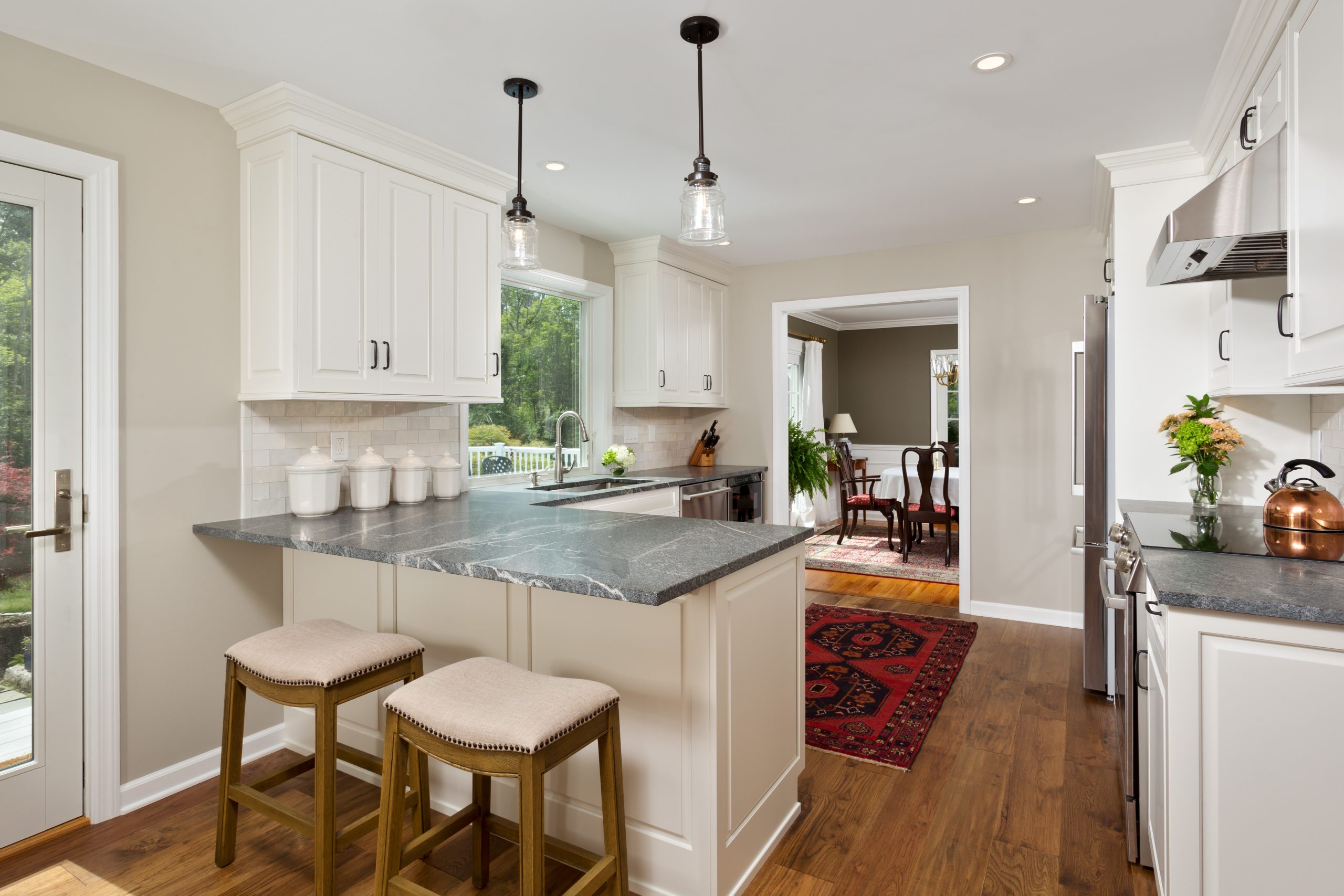
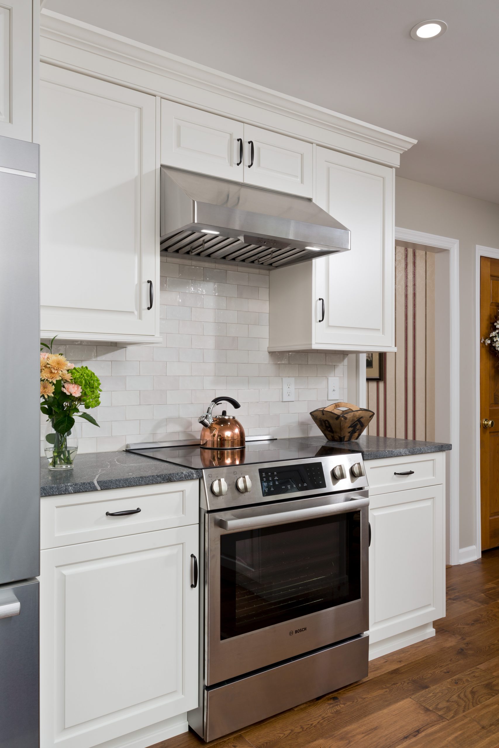
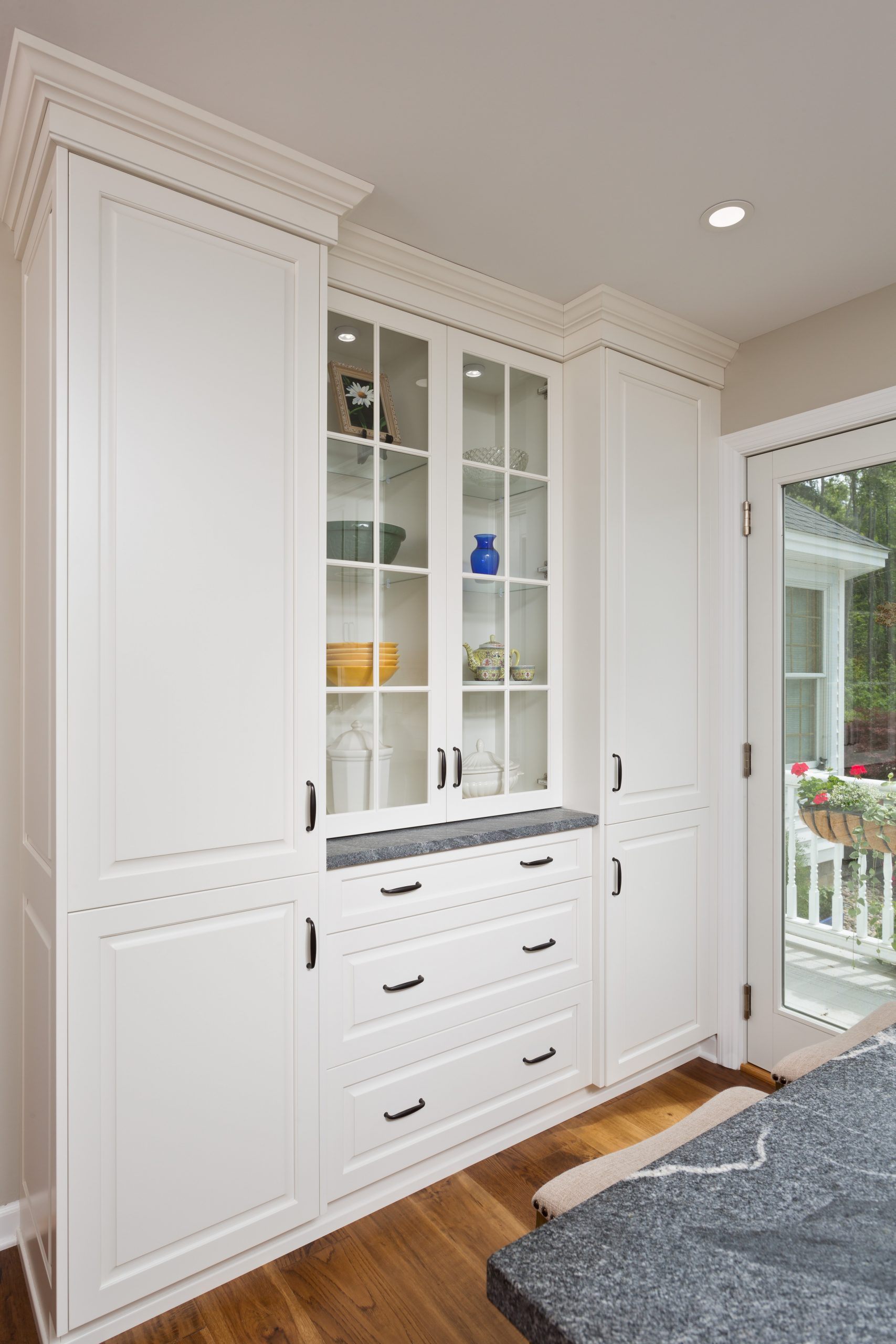
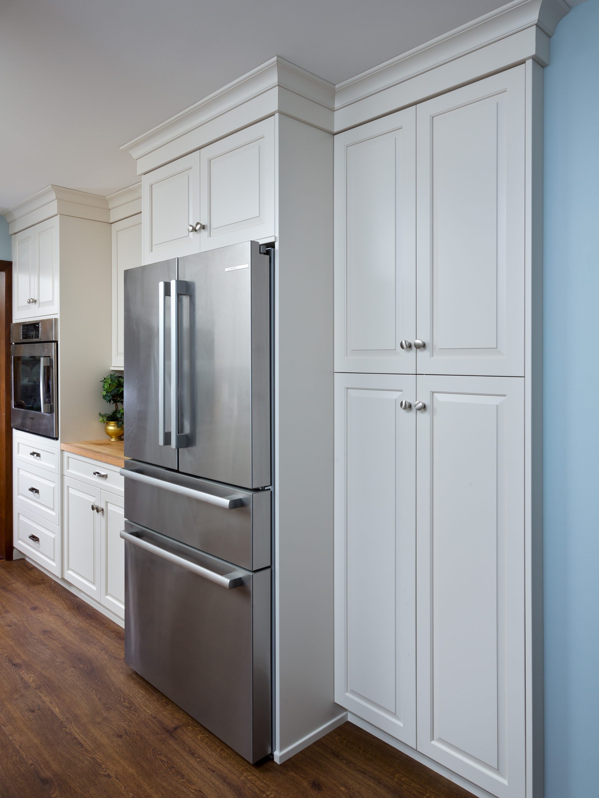
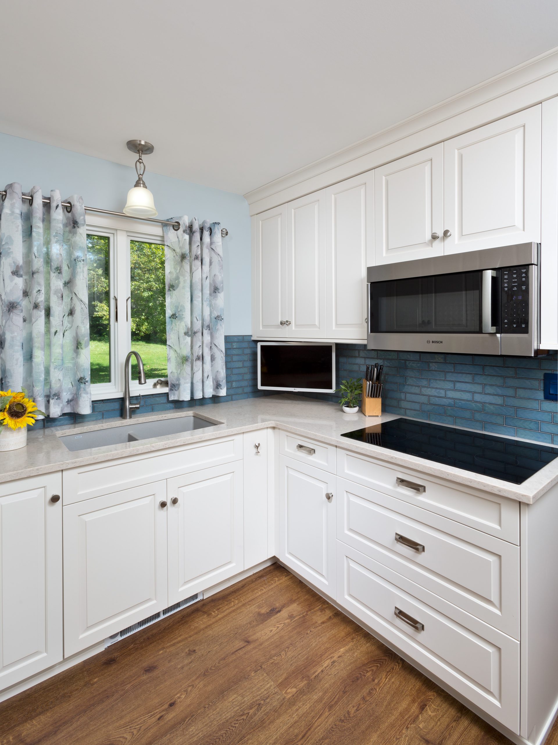
The upgrades were plentiful: cabinets with roll out drawers and shelving, updated Bosch appliances, and hidden task lighting. To the delight of our client, we even sourced and included a custom pull for the wine storage cabinet.

The existing sentimental butcher block counter was refinished and repurposed for a prep area. We used Leviton’s Renu® outlets and switches to bring a fun color to the dramatic backsplash. For ease of use and durability, we specified Earthworks Parkhill Luxury Vinyl Planking for the flooring, which gives the look of real wood without requiring as much work to maintain. 

We removed a kitchen that was designed and installed by the current owner over 50 years ago, with an abundance of sentimental value. It was so rewarding to see the homeowners so happy with the results, and not a shred of regret.


Making Space for Better Living…

One of the best things about a renovation is that it allows us to update the homes we love to work better for our families. The way we live our lives changes over time, and whether we need more space for our growing families, a different layout for entertaining, or better storage and organization solutions, a renovation can simply make life easier.

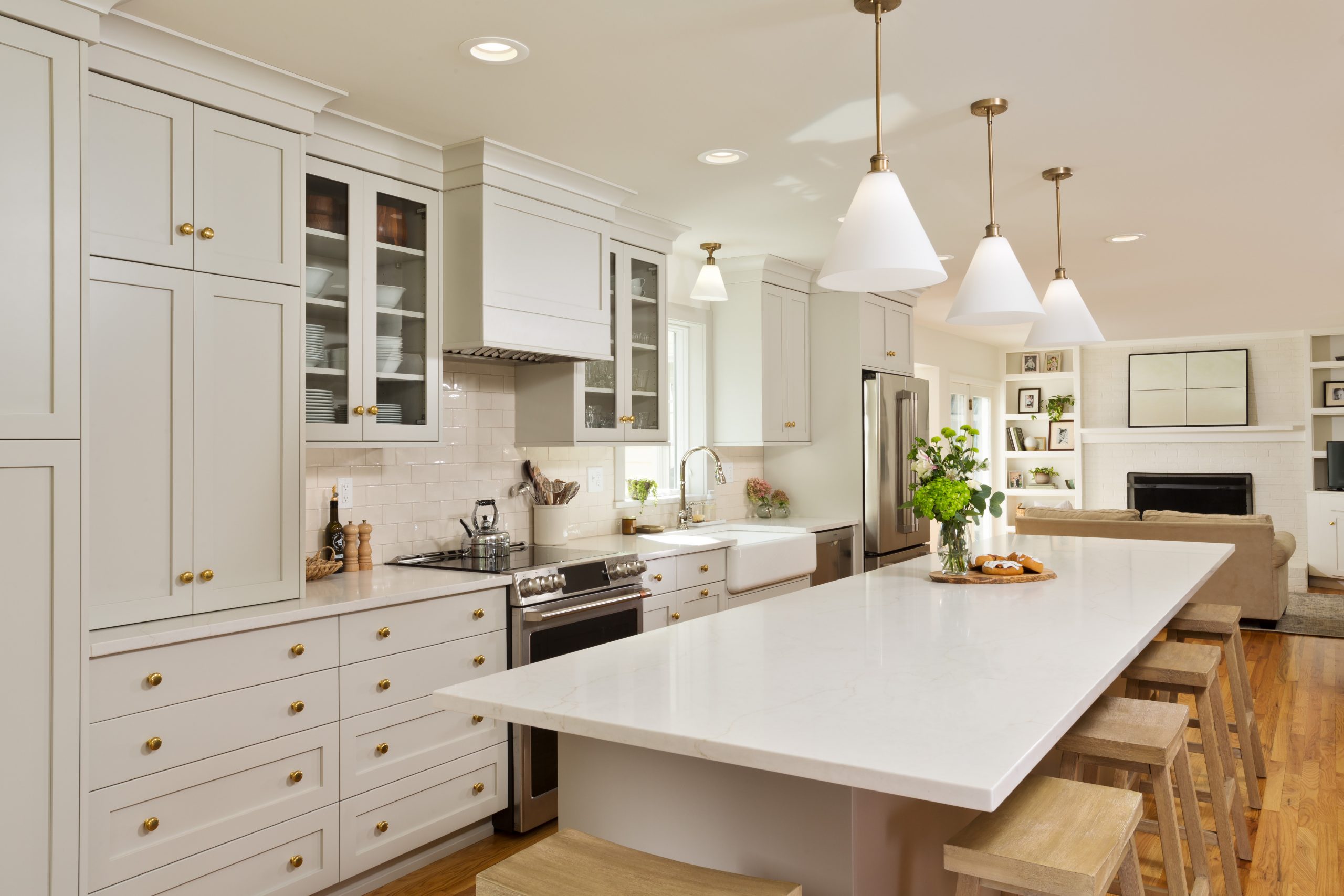
In this case, our clients wanted an open concept floor plan for their kitchen and dining areas, and more functionality for their everyday lifestyle as well as entertaining. We removed a wall between the existing dining room and kitchen to accomplish that goal. We focused on maximizing storage space and work space, most notably in the twelve foot kitchen island. We also included plenty of wall storage, which is a great solution for finding more organizational space in your home.

The design choices in color and materials selections gave the project the perfect aesthetic look–clean, crisp, and totally magazine-worthy.

Our clients were wonderful to work with, open to suggestions and collaborative. They are thrilled with their new open kitchen and dining area, and look forward to enjoying it for many years to come with their young family.

A Beautiful New Deck Adds Outdoor Living Space

We like to make the most of our temperate seasons here in upstate New York, and time spent relaxing or entertaining on decks and porches are some of the best ways to enjoy spring, summer, and fall. While we find ourselves in the thick of winter, let’s go behind the scenes of this deck renovation and daydream of sunnier days to come.

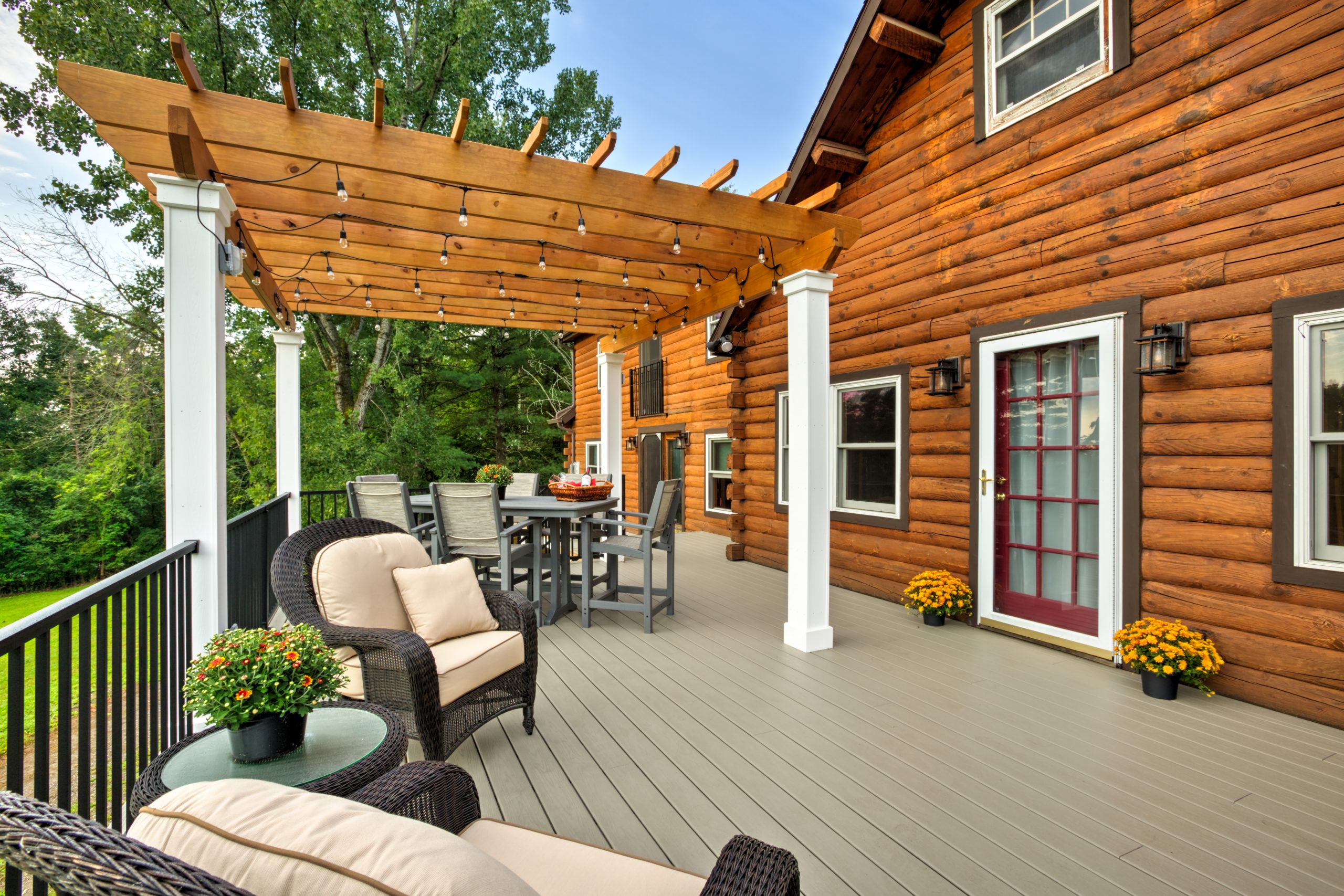
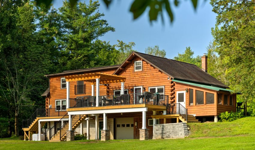
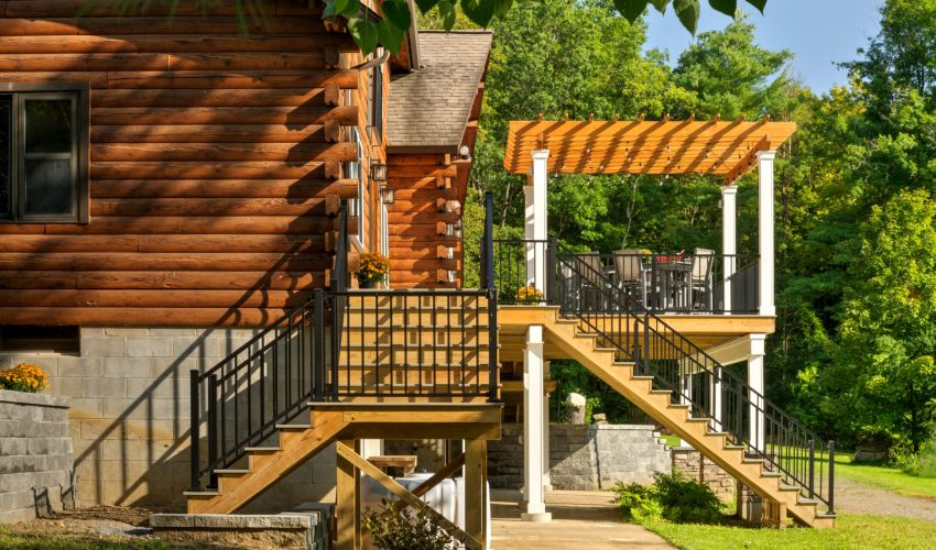
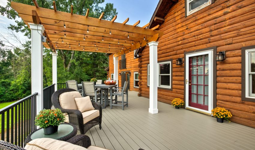
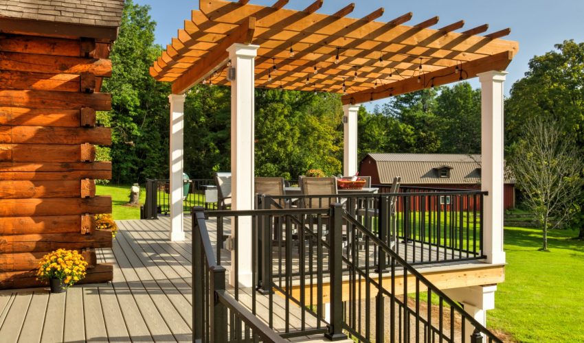
For this project, we removed a weathered, treated deck at the back of the home, and built a new deck with composite decking, aluminum railing, and a new pergola.

We added quite a bit of square footage, additional access points, and removed a second floor balcony while updating the look of the entire back of the home.

The back of this house includes a walk-out basement, and the area beneath the existing deck included a concrete slab that we needed to work around. The size and scope of this deck project was considerable, which required expert planning.

The black aluminum rail work really pops against the composite decking, and the project created so much usable space for the clients to entertain their friends and family.

Our clients thoroughly enjoyed their first season with their new, expansive outdoor living space, and we know they’ll continue to enjoy it for many years to come.


A Gorgeous New Kitchen for Longtime Clients

We are honored when our clients turn to Schrader and Company for repeat projects, sometimes over the course of multiple homes. That was the case in this Project Spotlight, in which we undertook a kitchen renovation for clients we have loved working with over the years, on many different home projects.

For this kitchen renovation, our clients didn’t need an expanded footprint so much as some spacing changes that would improve the room’s functionality for their lifestyle.

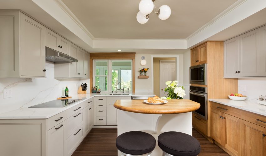
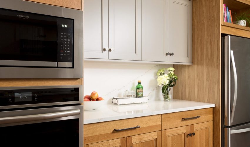
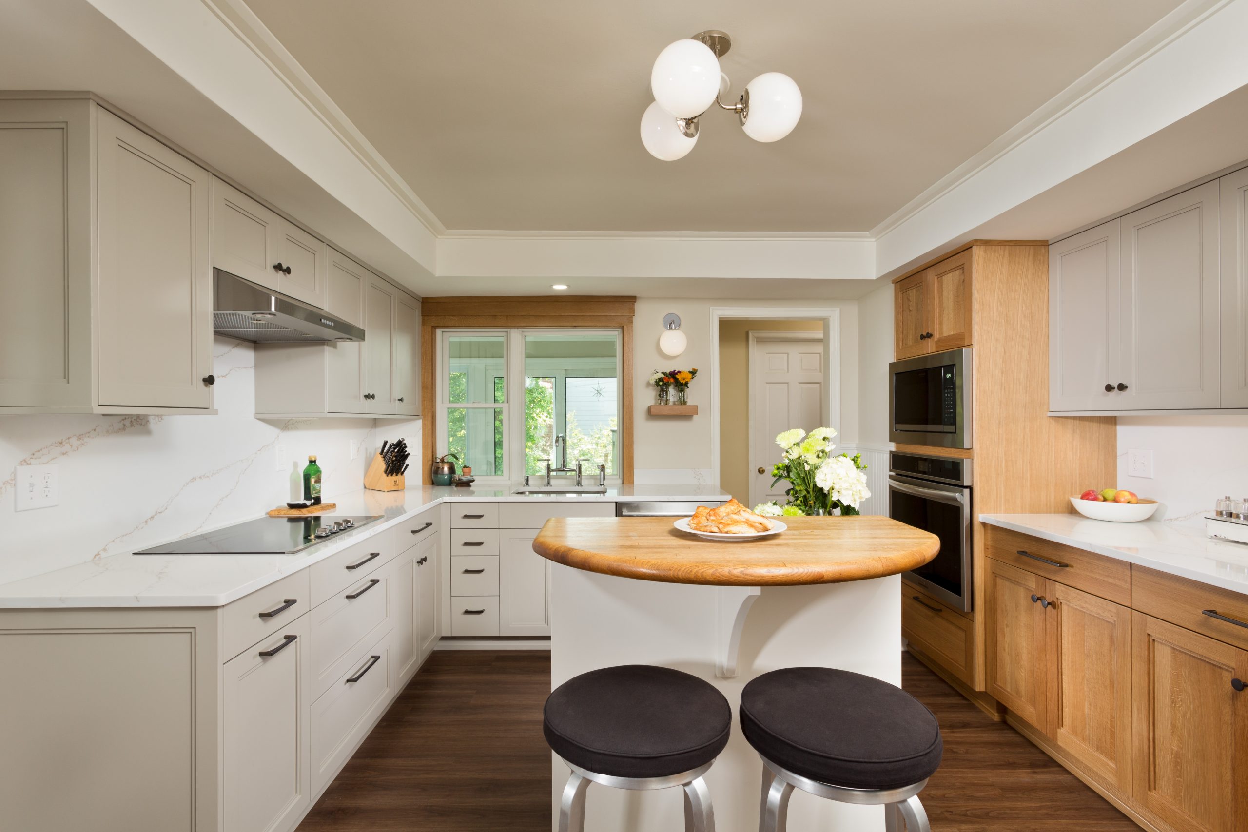
In addition to moving appliances to create a new flow, we installed new custom cabinets with quartz counters and full-height quartz backsplashes. We put in a new window unit, new appliances, and new luxury vinyl tile flooring. We built the new cabinets to the existing soffit at the ceiling perimeter, which the clients wanted to preserve. Custom moulding at the higher center portion of the ceiling adds visual interest.

The existing kitchen island remained, and interestingly, is a custom Schrader and Company creation that we built for the previous homeowners.

The mixture of painted and white oak cabinets is a beautiful design touch, and the thoughtful placement of the appliances gives the room a great flow for both cooking and entertaining.

It’s an absolute pleasure to collaborate with these longtime clients, and we are thrilled that they trusted us to bring their vision for their home to life once again.

Design Trends We’re Loving Lately…

We asked our brilliant in-house designers Brooke Weinert and Kara Woitkoski to share some of the best recent design trends they’re seeing in the industry today. This thoughtfully assembled list can help inspire and guide you as you look to make selections for your own home projects.

As always, Brooke and Kara are here to help bring your interior design visions to vivid life!

  • Larger Fixtures (in lighting & hardware specifically):

Larger Light Fixtures and hardware with texture or complimentary colors are huge right now. They’re being used more as statement pieces, which we love!

  • Textures (in backsplash, countertops, cabinet doors, etc.)

We’ve seen a decline in true square edge backsplash tiles and a rise in tiles that are handmade or look handmade, bringing in more character and texture with perfectly imperfect edges. It brings a much more natural and welcoming feel to any space. We’ve also been seeing more interest in mesh or metal panels in cabinet doors to bring a more interesting and detailed style to their homes. 

  • Color in Cabinetry

We have seen a lot more color being introduced in cabinetry, which is so much fun! We’re seeing a big increase in “natural” colors, like stone, slate blues, tonal greens, etc. While we love a classic white kitchen, it’s such a fun opportunity to work with color more frequently. This year specifically, we’ve had multiple clients who want to steer away from an all-white kitchen, saying it doesn’t feel “warm or homey” enough for their preference. With our recent clients who do want white, we’ve use other tones to support and bring warmth to the space; be it a wood island or two tone cabinetry to make it more interesting and welcoming.

  • Command Centers

Almost all of our kitchen projects lately have requested a “drop zone”, better known as a command center. We think with getting back into our normal, pre-Covid routines, we’ve also gotten back to our old ways, which means everything ends up on your kitchen counters! We don’t love that, so we like to design a designated area for all the little things from chargers for your phones, to organizing mail. We’re doing our best to help families stay more organized and keep their clutter out of the kitchen.

  • Tile and Wood Alternatives

While loving the look of tile flooring, people are wanting lower maintenance and more wallet-friendly options. Luxury Vinyl Tile (or Plank), known as LVT or LVP, has become extremely popular. They can give you the look of tile without the grout, while being much more forgiving on your body and joints. They can also replicate natural hardwoods, without worrying about scratches, water damage, or seasonal movement.

  • Natural Countertops

While we love the virtually zero maintenance quartz countertops, we have recently (surprisingly) seen a big comeback of natural stone countertops. Despite the fact that they require more maintenance and care, our clients have been consistently steering towards granites, soapstones, and even quartzites! They are made from the earth–a snapshot of a moment in time–and each slab is completely unique and one of a kind. That is tough to beat!


Making the Most of the Seasons with a Gorgeous Outdoor Living Space

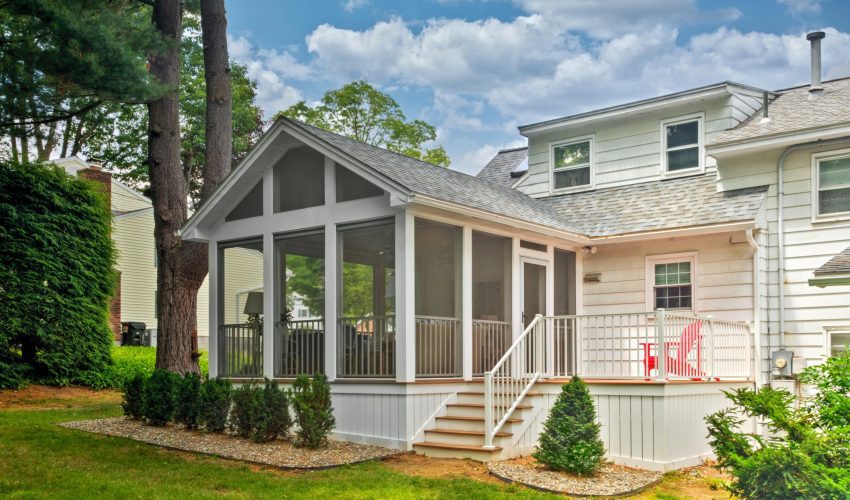
Here in the northeast, we know how to make the most of our seasons. Sometimes that means keeping the environment out so we can enjoy the great outdoors without pesky insects, or fear of inclement weather.

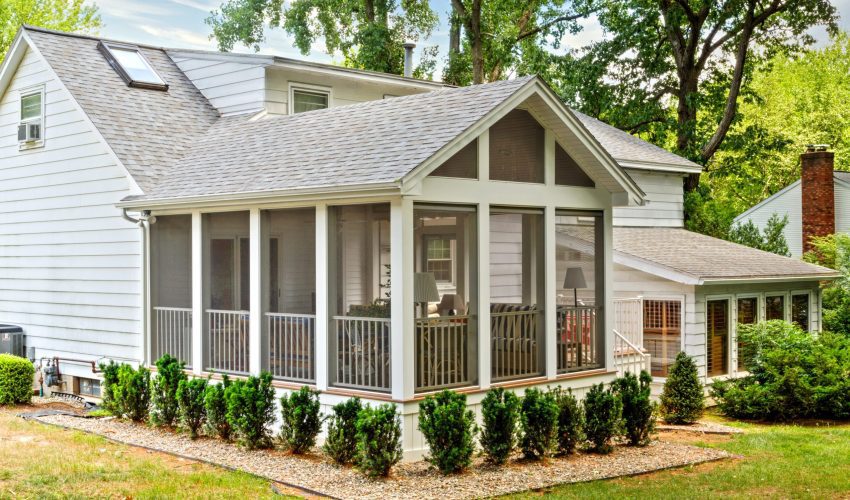
In this Project Spotlight, we take a look at a deck and porch renovation specifically designed to be used in as many weather conditions as the changeable seasons might throw at us, while still looking beautiful.
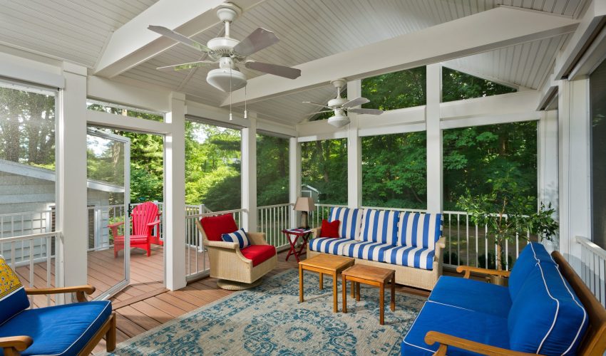
Like so many of us, our client wanted to be able to enjoy her time outside without being bothered by bugs, or rain.

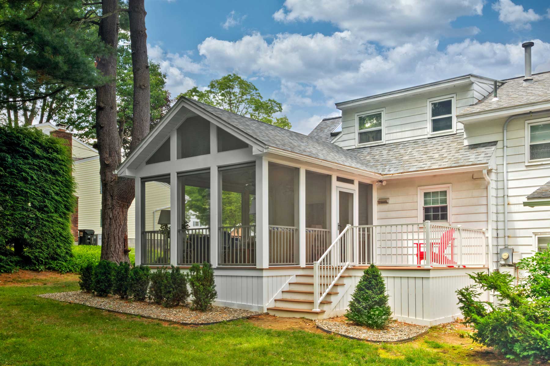
We removed decking and railings from the existing deck, but the previous deck framing remained. We supplemented the deck framing, added helical piers for support, extended the existing deck, and framed a roof to create the screened porch.

For the screens, we used the ScreenEZE screening system, which works well, and offers unobtrusive clean lines that don’t detract from design elements.

The finished product is very low maintenance, and as you can see in these photos, bright, spacious, and functional.

Adding outdoor living space to your home adds square footage and ample opportunities to enjoy warm summer days, cool autumn nights, and everything in between.

If you’re interested in a screened porch, deck, or patio, call us to talk about the possibilities for your home!


A Dramatic Renovation That Feels Like a New Home

A well-planned and well-executed renovation can sometimes be so dramatic, the end results feel like a completely different home!

In this Project Spotlight, we take a look behind the scenes of an extensive remodeling project, covering two floors and multiple rooms.

The goal of the renovation was to create spaces that better worked for the family and their lifestyle. The clients had outgrown the existing space, and they wanted to update the aesthetic in the kitchen especially.

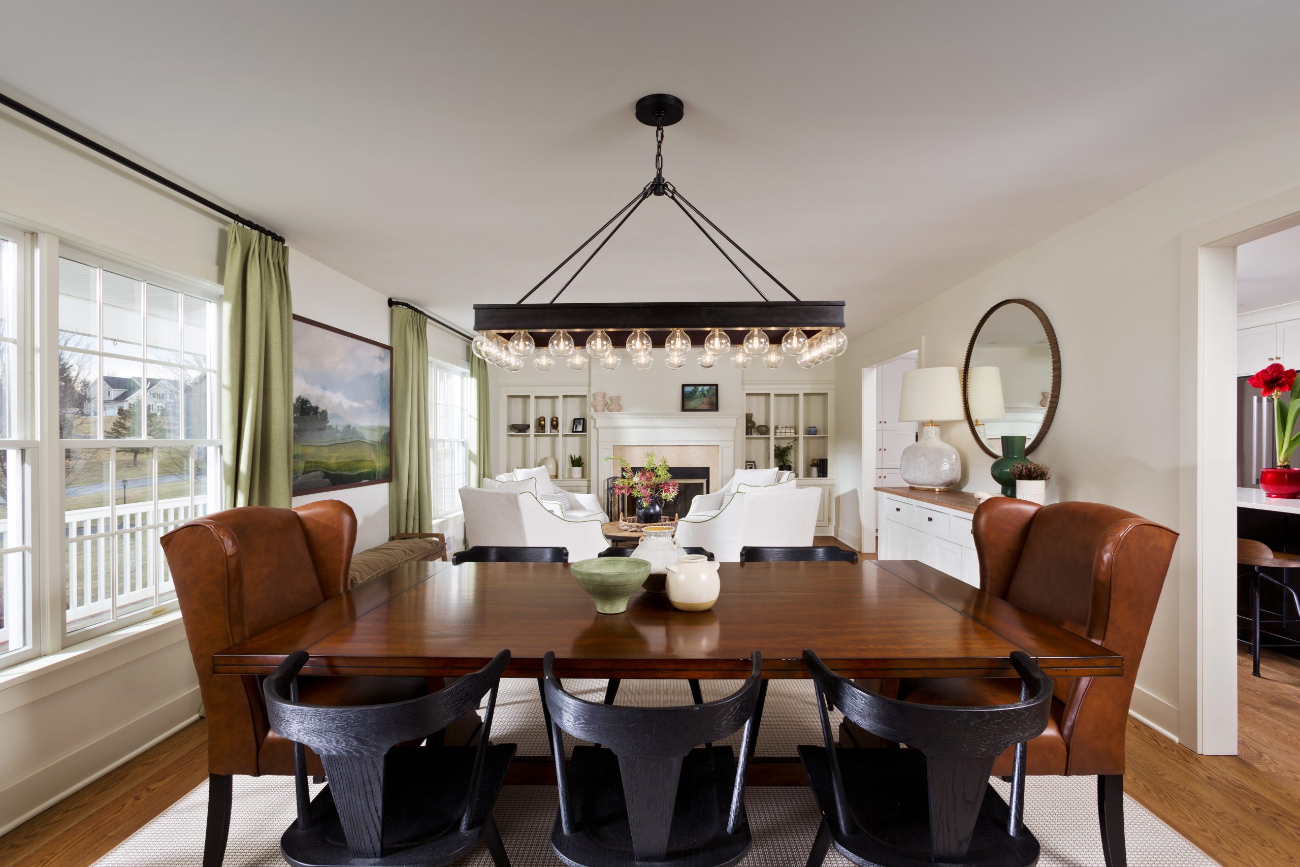
We renovated a large portion of the first and second floors of the home. On the first floor, we renovated the kitchen, mudroom, dining area, and parlor. On the second floor we removed the master bedroom and master bathroom. This space was rearranged to create two bedrooms and a main bathroom. We then removed the roof from the existing garage and created a new master bedroom suite.

The kitchen/mudroom space was opened up to create a better flow. The transition of each area as well as the finishes that were chosen are spectacular.

The difference between the original and finished spaces is nothing short of amazing. It almost feels like a different house altogether.

Our clients are so happy with their renovated home, and we are beyond gratified to know the project came together in such a satisfying way for everyone involved.


A Beautiful Bathroom Renovation, with Future Safety In Mind

One of the best things about renovation is that it allows us to reimagine our living spaces in ways that work better for how we actually live, without leaving the homes we love.

In this Project Spotlight, we’ll go behind the scenes of a gorgeous bathroom renovation that took away unneeded elements, improved and modernized the space, set the clients up for aging-in-place, and reflects a more updated aesthetic.

The overall intent of this renovation was to update the existing bathroom. The existing bathroom’s design and materials were dated. The bathroom included a big garden tub surround that was hardly ever used, fiberglass shower unit with a bulky glass door unit, and linoleum floors. We removed the tub and reallocated that space with a custom window bench flanked by custom linen towers. The shower was a fiberglass unit that was hidden, so we re-oriented the shower location to be more of a focal piece with open glass design, tile floor, tiled walls, shower seat, all new Kohler Margaux® shower controls and rain heads in Vibrant® brushed nickel, with frameless glass walls and door. The toilet was updated to a comfort height Kohler Kelston® toilet. The color scheme went from earth tones of beige and brown to vibrant whites and blues.

With mostly white tile in the shower, we chose to upgrade the shower door and wall glass to “low iron” glass. The low iron glass does not have the greenish tint that standard shower glass normally has, and allows the selected white tile to appear bright white as selected, not green. The eight inch shower head features Kohler’s innovative Katalyst® air-induction technology, which efficiently mixes air and water to produce large water droplets and deliver a powerful, thoroughly drenching overhead shower experience.

The clients had a desire to update while considering some aging in-place options, such as a comfort height toilet, a low shower threshold with shaving shelf, grab bars, an easily accessible shampoo niche, and blocking for future needs. The window seat was designed to have a place to sit outside the shower. All door hardware and sink and shower controls are lever type for ease of use.

Replacing the big inset tub with the built-in window seat and linen towers provides more usable and functional space for the client.  

The overall look of the finished project is classic, elegant, and updated. Our clients are very happy with their beautiful new bathroom, and can enjoy it safely for many years to come.